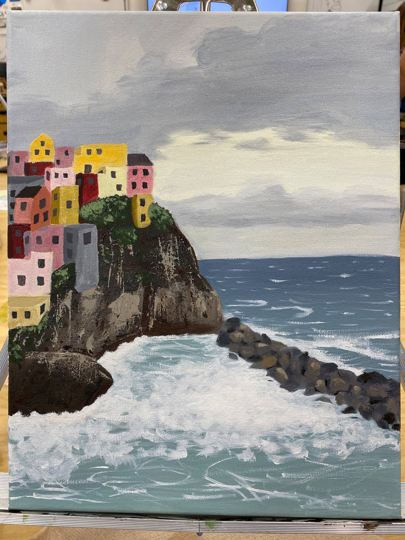
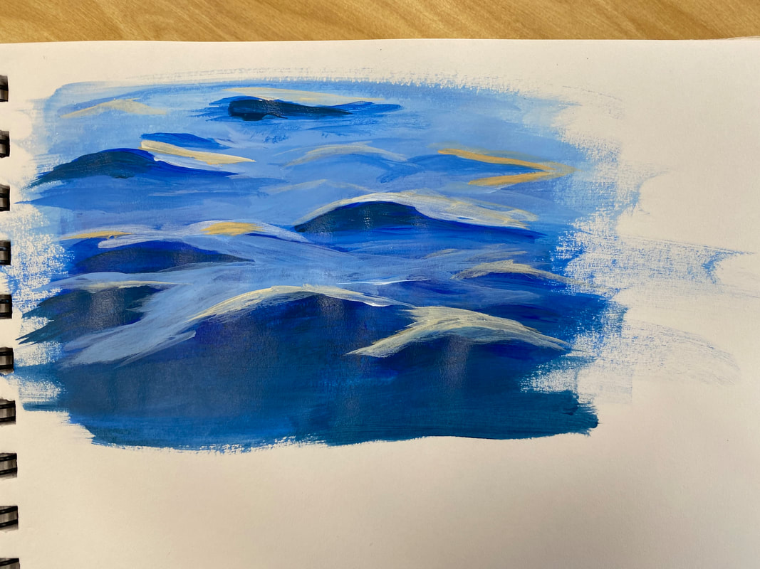
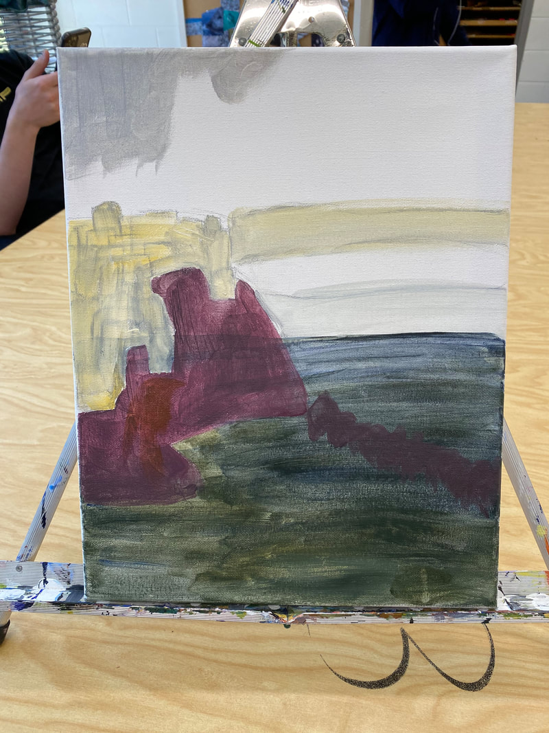
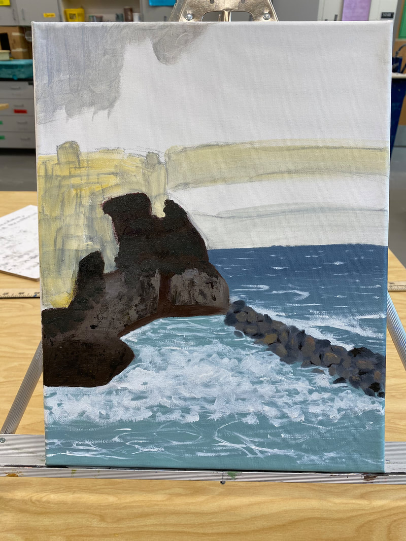
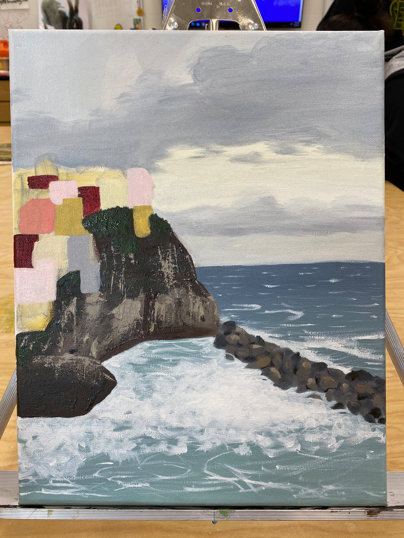
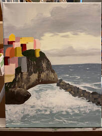
 Explanation: My piece is a painting of a city in Italy named Riomaggoire. There are lots of buildings on a cliffside on the left side of the painting. Surrounding the cliff and extending out to the horizon is the ocean, which fades from a light to a dark shade of blue. There is also a band of smaller rocks extending into the ocean from the base of the cliff and lots of froth and foam on the water near the cliff and band of rocks.
I loved the oil painting process. I really liked all the colors I was able to create with oil paints and how easily the paints blended. I enjoyed the process much more than painting with acrylics, I had a lot of fun trying to create new colors and textures, and experimenting with different thicknesses of paint. I also liked how painting with oils forced me to try painting with less precise strokes since getting straight edges with oil paint is really hard. I liked that the oil painting process pushed me to try new techniques and approaches, and overall, I really loved painting with oil paints. This landscape piece is depicting a city in Italy named Riomaggoire. This piece has a lot of meaning to me. I visited this city a few years ago with my family and I spent the day with them walking through the streets, trying local food, and enjoying the scenery. This city was incredibly beautiful as it was right on the ocean, and it was also isolated. There weren't many tourists or big roads around, and I loved it. I had so much fun with my family that day just enjoying the environment and company, I felt very calm and relaxed. I tried to capture those peaceful and sheltered feelings in this painting. This painting means a lot to me because it reminds me of a fond time I had with my family.
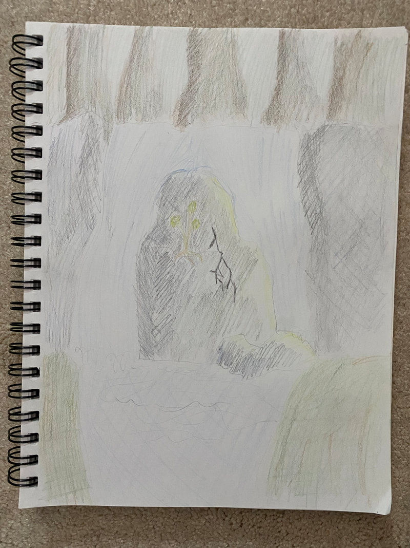
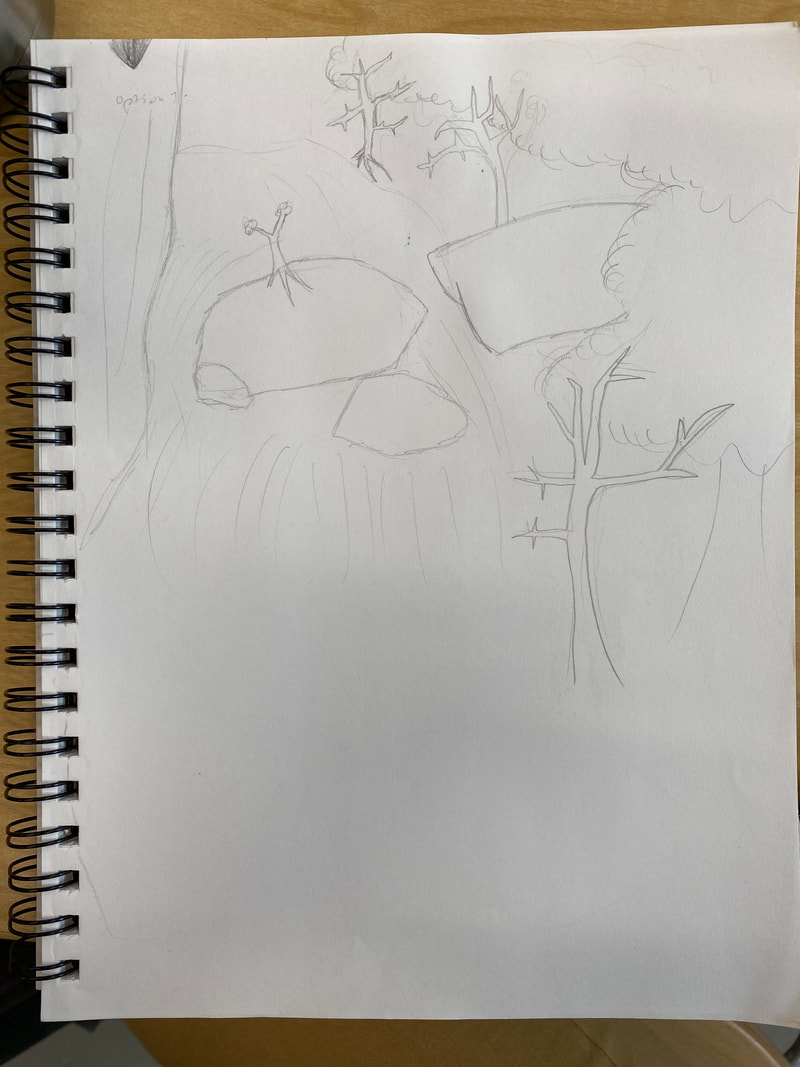
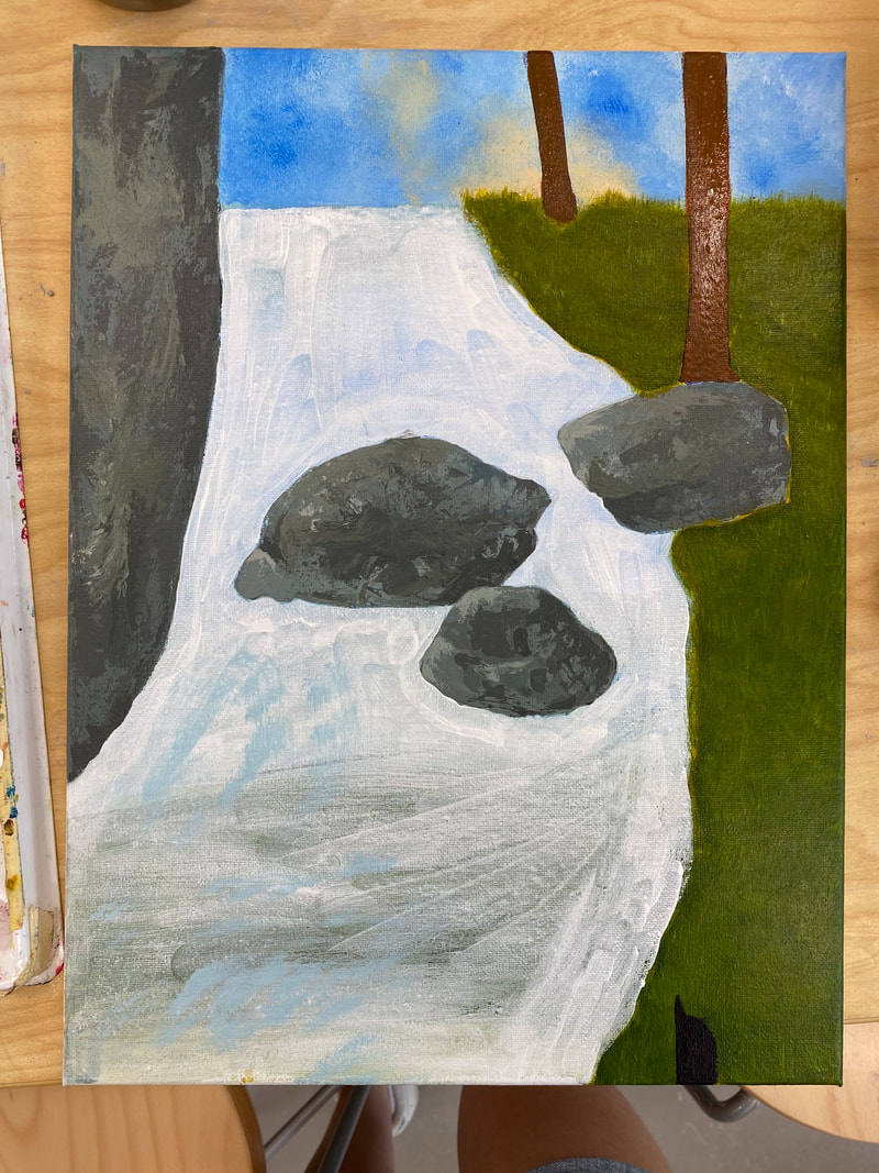
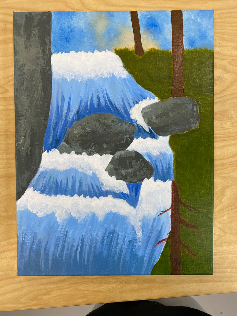
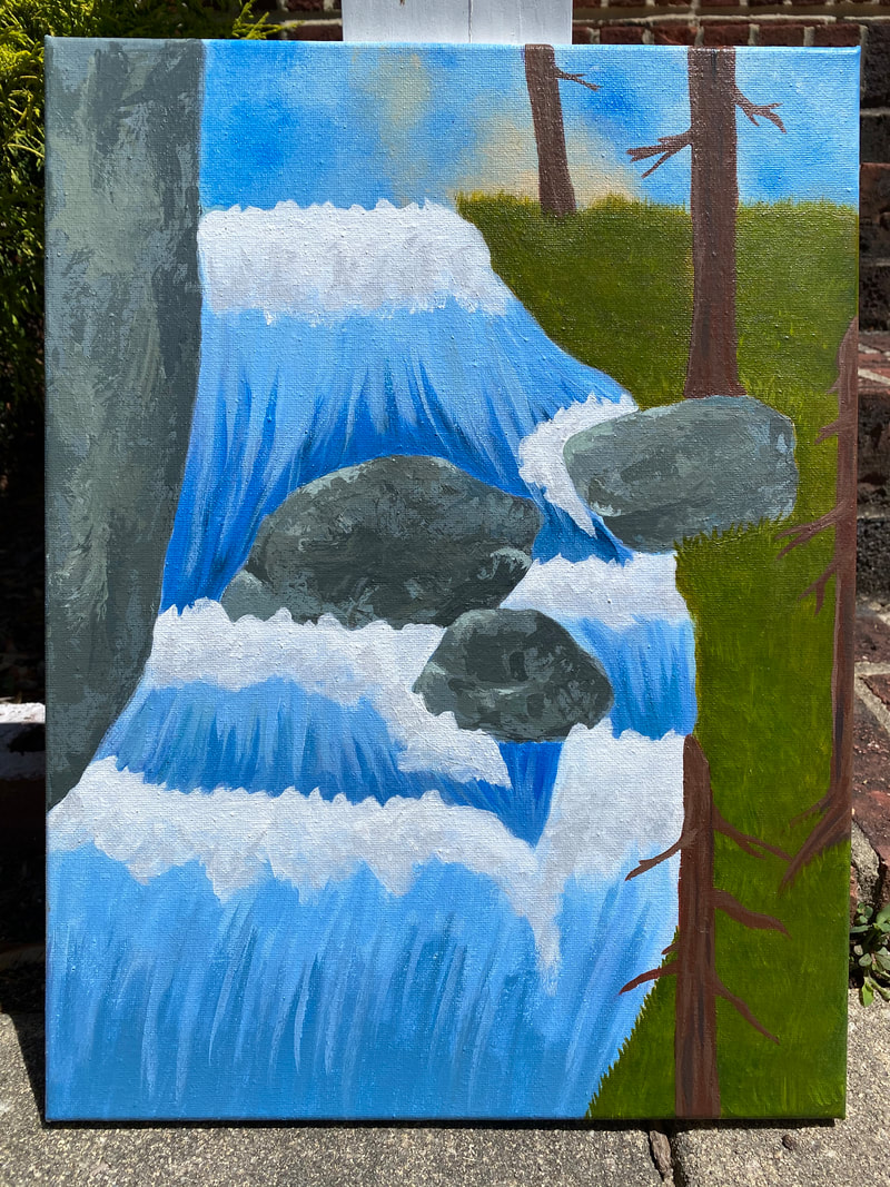 Description: My piece is a painting of a waterfall, which is centered in the middle of the piece. The waterfall is running down a hill and acts like a river would. The waterfall has a series of drops indicated by white froth in the water. To the left of the waterfall is the base of a stone cliff. In the middle of the waterfall are two large stones/boulders, and there is one stone/boulder on the right bank. To the right of the waterfall is covered in yellow-green grass, and bare trees with skinny branches. Part of the sky can be seen at the top of the painting, with orange light from a sunrise coming up behind one of the trees. For the rocks I used lots of gray, green, and blue tones mixed together. The grass has a yellow and green color scheme while the trees are a reddish-brown. The waterfall had different shades of blue and some gray-green colors in it. The sky is made up of light and dark blue splotches with some orange from the sun. Overall I tried to use lots of grays, greens, and blues in my piece to mimic the color scheme of the original piece I was inspired by.
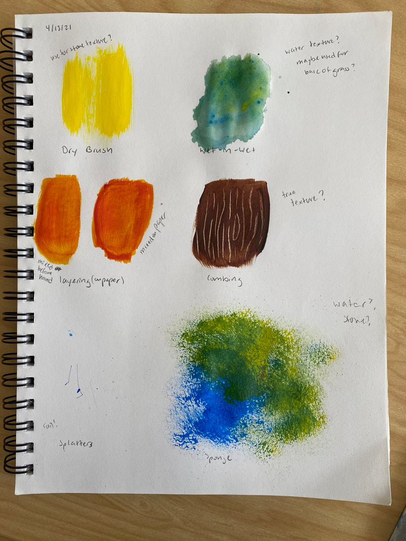
Analysis: In my piece I use elements and principles such as color, shape, texture, emphasis, and movement. I used color by trying to create a color scheme that incorporated lots of blue and gray tones/undertones, and attempting to use more muted colors for the grass and trees. I used shape through the trees and rocks. I made the rocks different shapes and emphasized the shape of the trees by having no leaves and drawing attention to the unique outlines created by the branches. I used texture a lot in this piece. For the rock/stones I used a pallet knife to paint an organic texture. For the grass I used the spread out bristles of my paint brush to paint blades of grass. I also layered many colors using this technique to give the hill texture. On the trees I tried to paint some rough texture to the bark through the lighting. I used emphasis in this piece through the placement of the subjects, and the color scheme. I placed two large rocks in the waterfall to draw attention to the water, and used the stark contrast of white foam on blue water to draw attention to these rocks, and waterfall even more. I also used color in the sky, and emphasized the sunrise and the tree in front of the sunrise through the use of complimentary colors. Finally I demonstrated movement in this piece through my paint strokes. When painting the waterfall and using different blues, I painted in the direction the water was flowing to create a sense of movement. Similarly I painted the grass blades in many different directions to avoid a uniform grass texture and to add movement to the grass. Interpretation: The mood of this piece is tranquil, but amazed. The scene painted is very peaceful in itself. It's a natural scene painted right at sunrise. However, the movement of the water, with all the foam and splashes is meant to be interpreted as powerful, leaving the viewer in awe and reminding the viewer that while nature is beautiful and can be serene, it is still powerful. This is also represented through the trees. The trees are in a beautiful location but are bare and seem more rugged, reminding the viewer that nature does not have to be delicate to be beautiful. Judgement: I think my piece was successful. I loved the grass, especially at the top of the hill. I believe this is where the most depth was shown in my piece, and I really liked the colors of the grass up there. I think the texture on the rock was successful, especially with all the colors I used, which built up the texture even more. I used many different painting techniques in this piece, and I think they all worked out well and how I intended them to. I also think I did a good job of keeping some elements from the piece I was inspired by, especially the texture of the sky. If I were to redo this painting however I would try and make the perspective better. I believe I am lacking depth in this piece, and it makes the hill look flat and doesn't have the sense of distance I wanted. I might also make the waterfall less blue and add some more grays into the water. 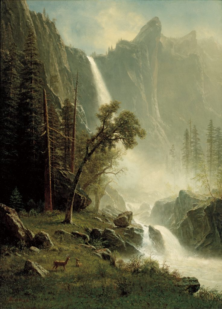 Colors: In this piece there are a lot of dark greens, browns, and shades of gray. There is also some blue in the sky, although it is muted. I would say this is an analogous color scheme since green and blue are right next to each other on the color wheel. Additionally, the shades of brown used in this painting seem to have yellow and green undertones which would fit into an analogous color scheme.
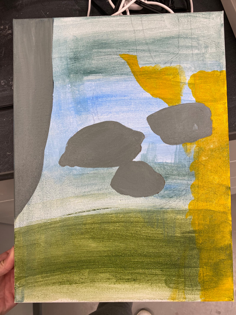
Textures: The textures in my piece are visual. I see lots of bumpy, hard, and rough textures because of all the stone. The tree bark, leaves, and grass in this painting also look like they have scratchy textures. The smoothest textures in this painting are found in the sky and some areas of the waterfall/river. Subject: This piece of art is showing a landscape. The main subjects include the leaning tree in the center of the piece, the waterfall in the background, and the two deer in the bottom left corner. I would say that the subjects in this piece are all emphasized through the lighting. The leaning tree is once of the few trees in the sunlight, and seems to glow since its leaves are catching the light. In this painting the light actually reflects off of the fur of the deer, which helps draw attention to them. Meaning: I believe the piece is trying to show that nature can be rugged and powerful while still being beautiful. This piece shows a beautiful landscape and has lots of detail and life in it. There are lots of delicate plants in the grass, and some sapling trees are seen on the right side of the painting. However, there are also bare trees with rugged branches, and rough, broken rocks. The waterfall, while beautiful to look at, is painted with movement, and captures the thunderous power of the water. As a viewer I clearly see the raw, rugged parts of nature, along with its power. I also clearly see the delicacy of nature as well. Albert Bierstadt
Bridal Veil Falls, Yosemite 1871-1873 36 ⅛ x 26 ⅜ inches Oil on Canvas In this piece I really saw the beauty of nature, but also the power and more rugged parts of nature. I typically think of beautiful, pure, and delicate life when I think about nature. However in this photo I see not only nature’s beauty and grandeur but also the more “ugly” parts like the dying and broken trees, and the jagged rocks. I also see how powerful nature can be with the enormous waterfall and the movements of the water. I chose this piece because I liked the color scheme and the lighting. I loved the darker, dirtier color scheme. I liked that the blue sky felt a little bit muted, and that the dark greens and browns were emphasized. I also liked how the light made some areas like the little field, the leaning tree, the bare trees, and the face of the cliff seem to glow. I liked the contrast of this “glow” by heavy shadows on some of the smaller rocks, the forest on the left, and the grass in the foreground. This contrast of lighting really made the piece pop out to me and drew me in. II felt like it had a lot of depth.
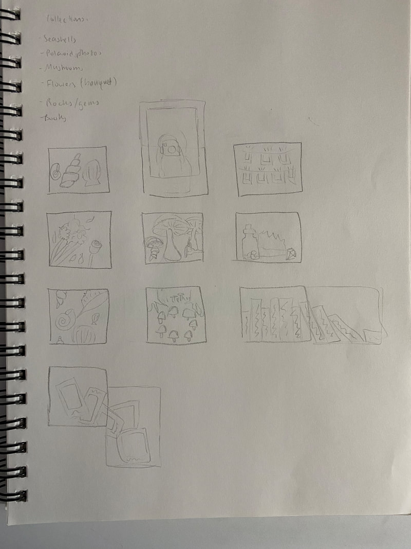
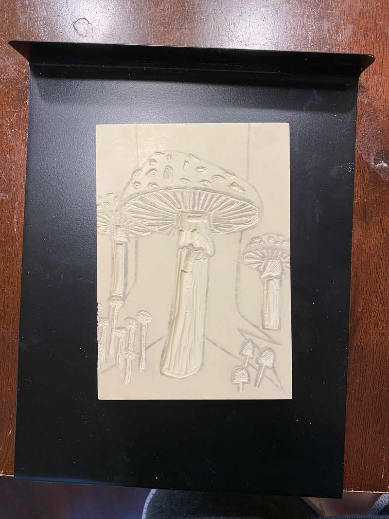
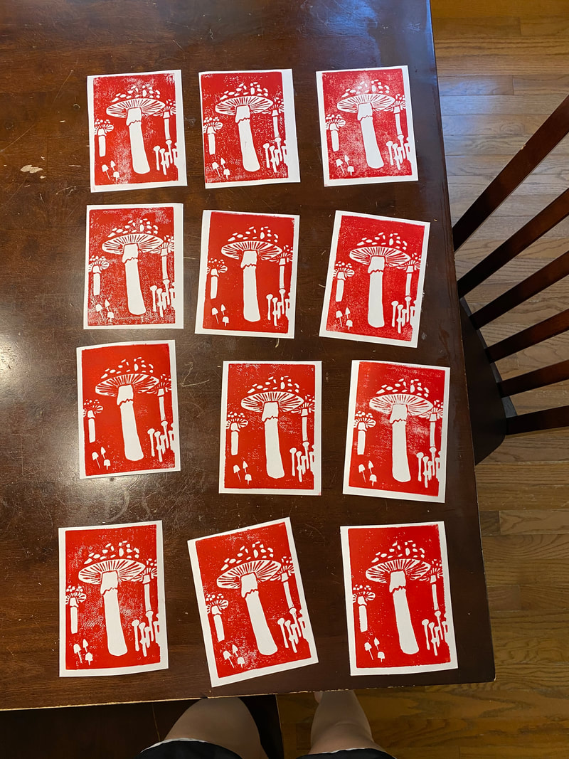
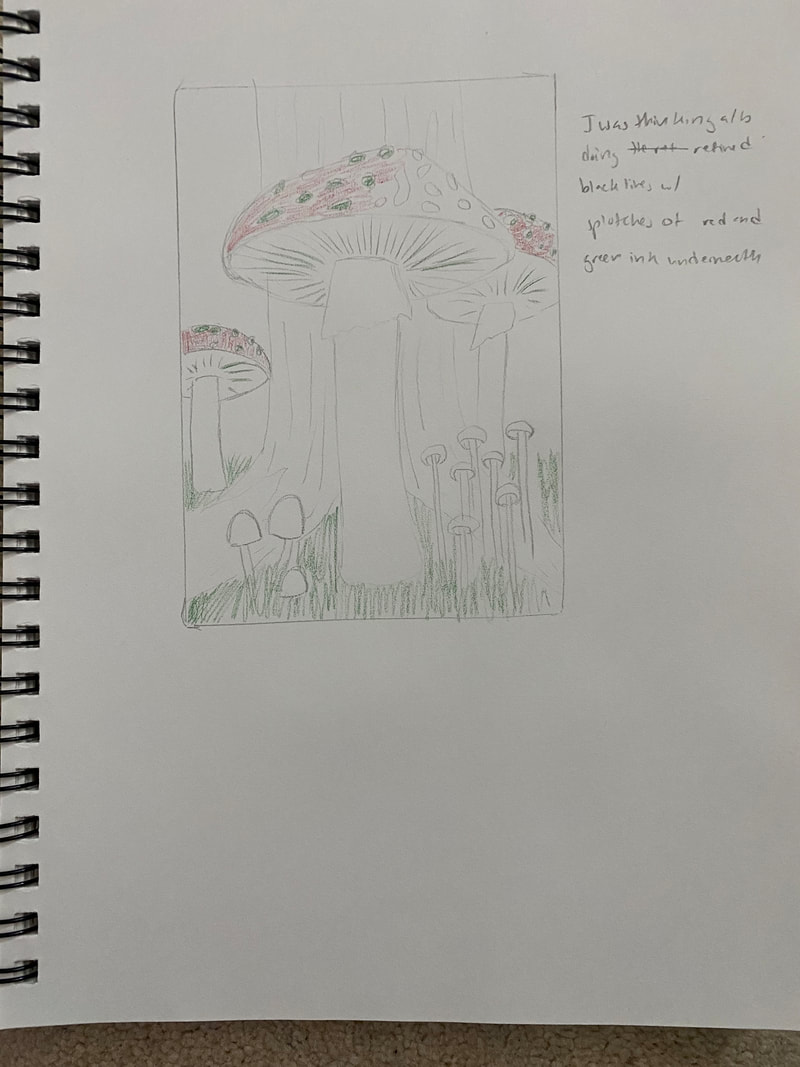
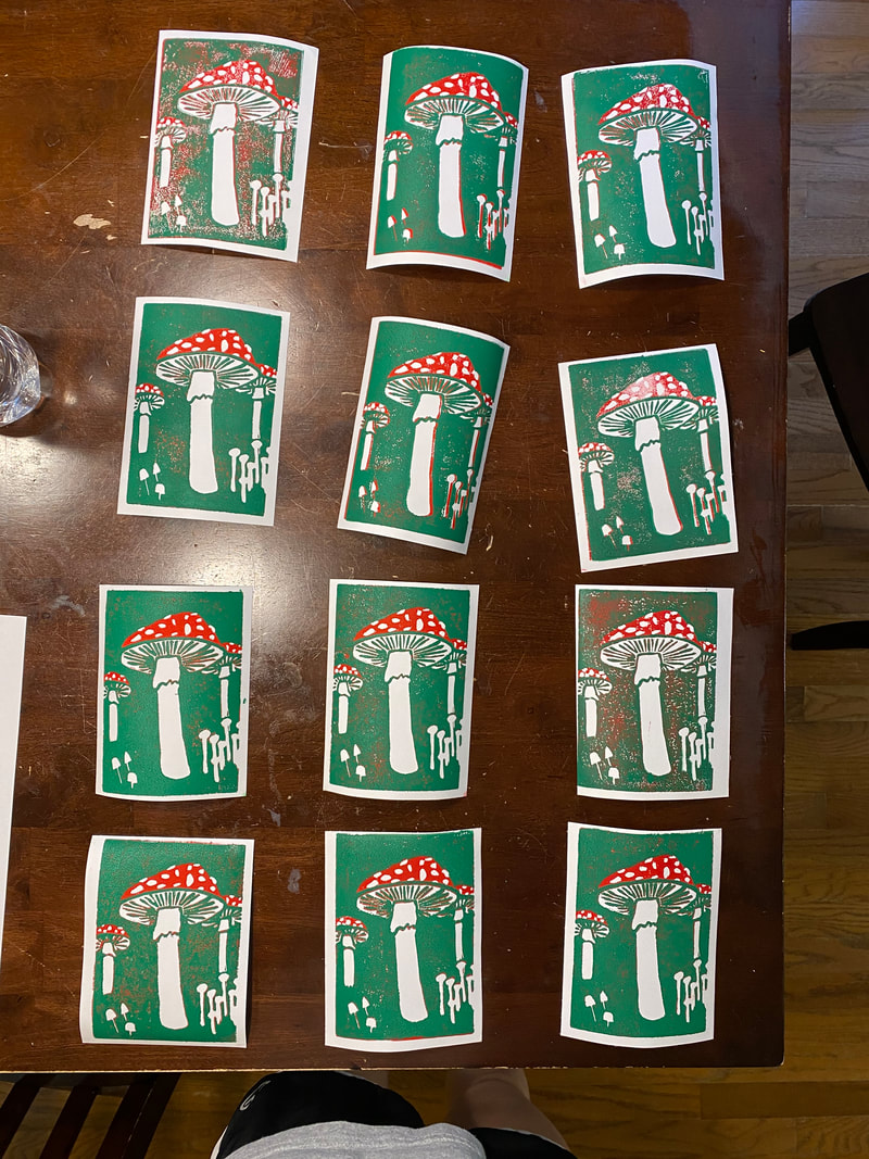
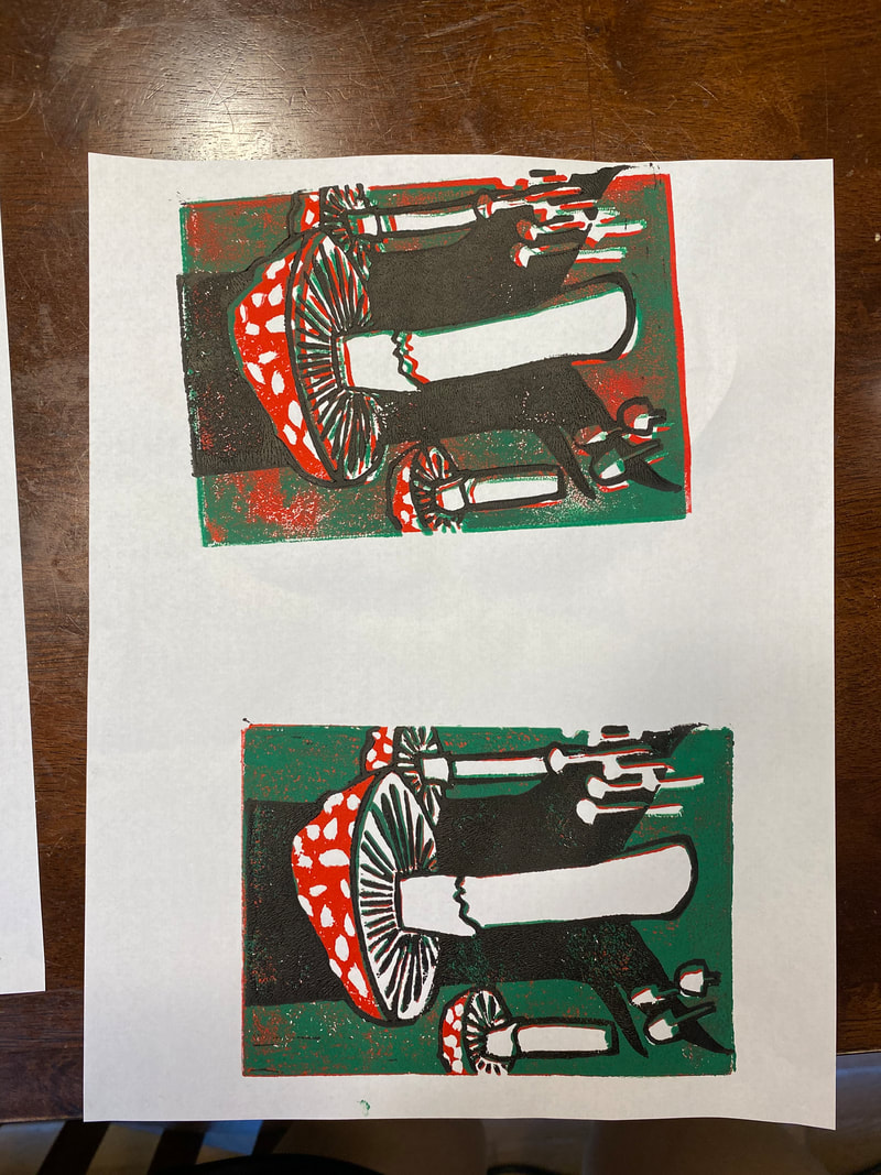
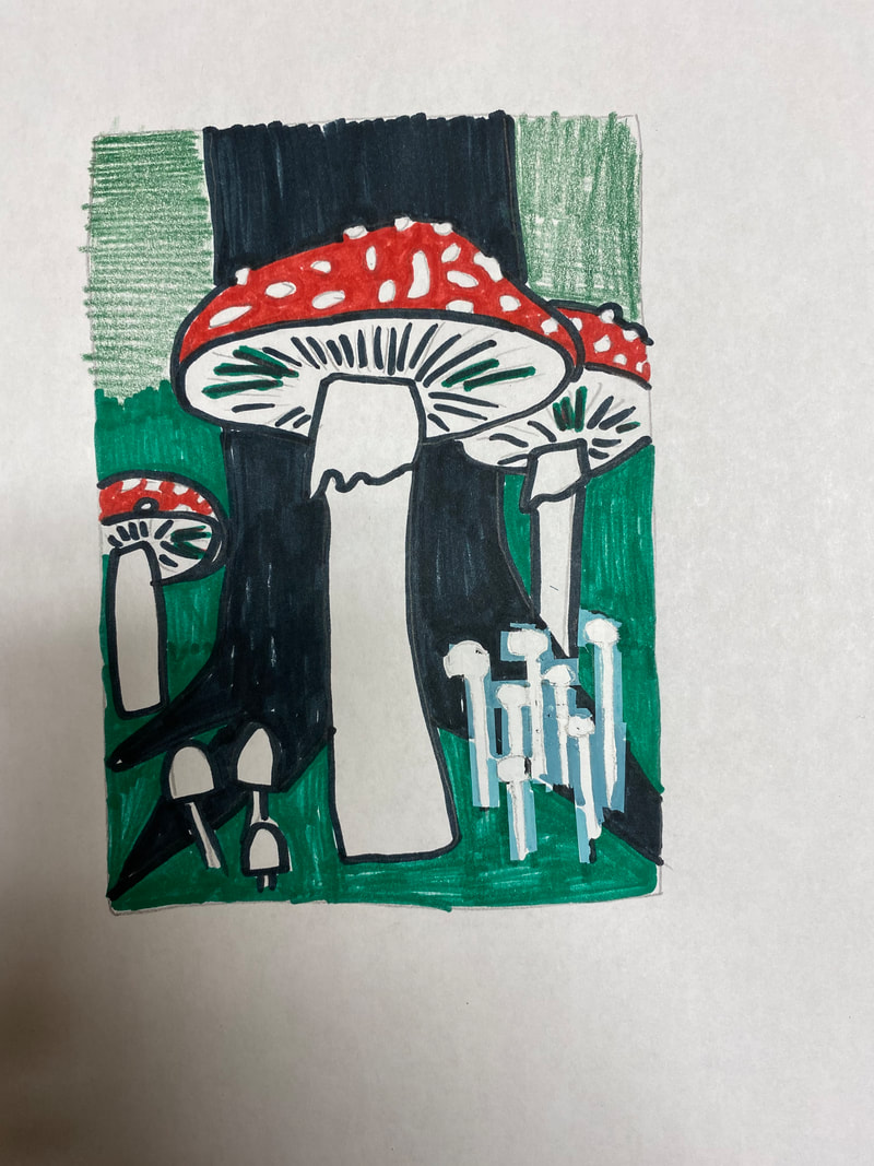
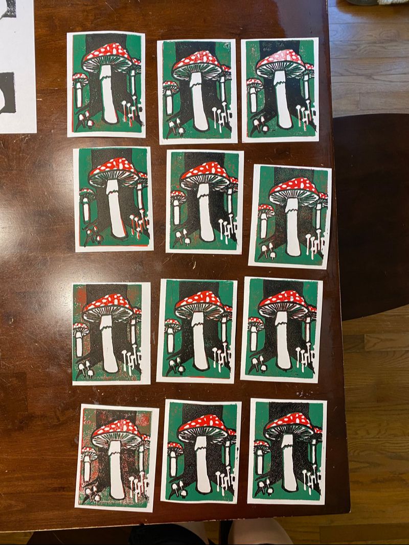
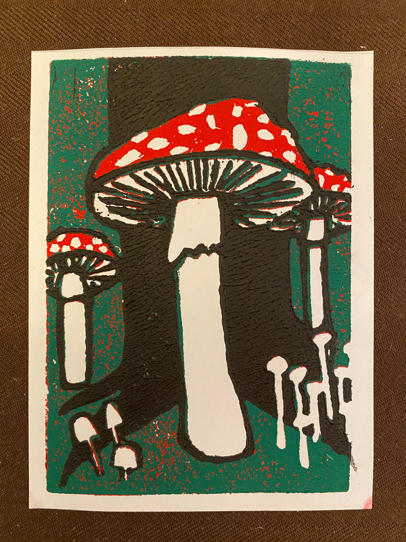 Description: My piece is a print of mushrooms. There are three toadstool mushrooms in the print. For all three of these mushrooms you can see part of the underside of the mushrooms. There is one toadstool in the center of the print that is the largest. It is in front of the bottom section of a tree, with the tree's roots extending along the ground on either side of the mushroom. There is another toadstool to the right that is partially behind the first toadstool and the tree's roots. The third toadstool is farther back in the distance making it smaller. It is on the left side of the print. The toadstools have red caps with white spots on them, and lines of varying thickness on the underside of the mushrooms extending outward from the stem of the mushroom. The stems of the mushroom are outlined while the stems remain white. The tree in the print takes up most of the background and is black. There is a group of tall skinny mushrooms with small round heads on the bottom right corner of the print. They are all white, have varying heights, and are clustered together, but they are not taller than the toadstool in the middle of the print. There are also three small white mushrooms with larger caps and skinny stalks on the bottom left corner of the print. They are outlined in black and are the smallest mushrooms of the print. The remaining space in the print (the floor and background besides the tree) is a green color to represent the grass and plants in a forest.
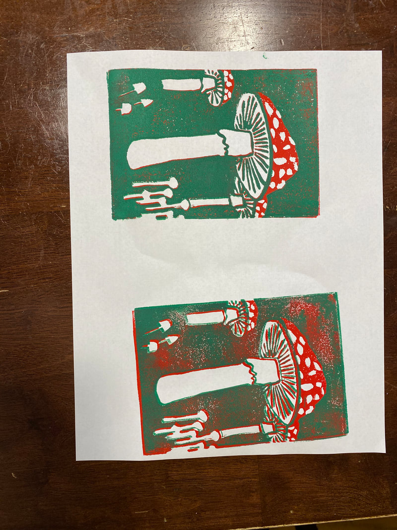
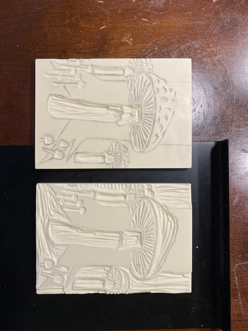
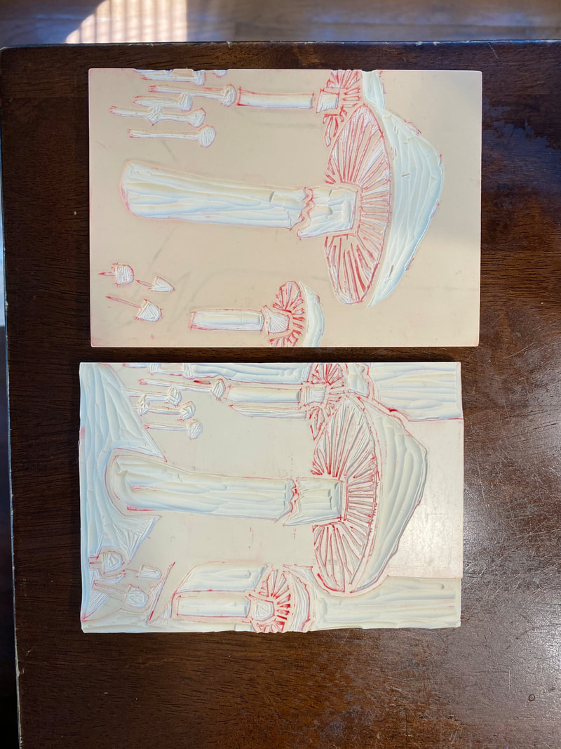
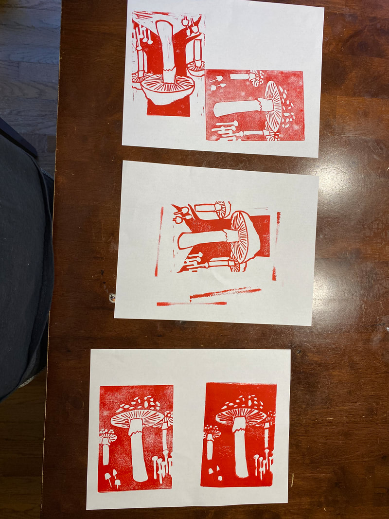
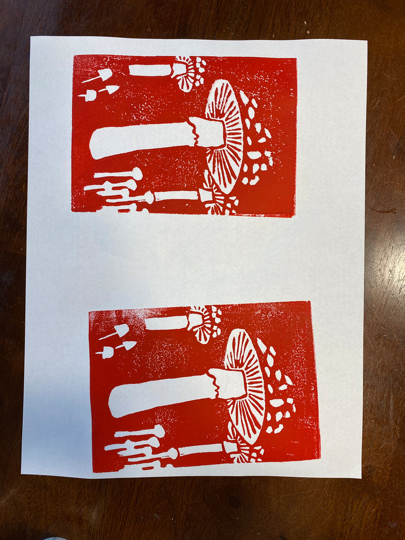
Analysis: Line is used in my piece through the outlines of some of the mushrooms and the lines that extend outward from the stalks of the toadstools. The lines used to outline the mushrooms in my print bring attention to the mushrooms and create visual weight. For example, the skinny mushrooms on the right of the print are not outlined because there are lots of them, which brings attention to the group. However, the mushrooms on the left are outlined because they are both smaller and less numerous which would mean they would not be as noticed. To balance the visual weight of the mushrooms I outlined the smaller group on the left to help bring more attention to them. Additionally the lines extending from the stalk of the toadstools on the underside of the mushrooms have varying thickness. Typically the lines towards the left and right “sides” of the mushroom are thicker while those towards the middle are thinner. Additionally in some cases some lines are thicker as they extend outward from the stalk. These varying thicknesses add character and a sense of movement to my print. It also makes the mushrooms seem more natural since things are not perfect and are organic in nature. Contrast is used in my piece through the colors and sizes of the mushrooms. The large, thick toadstools contrast the smaller, thinner mushrooms in the piece. Additionally the green and red colors used are complimentary colors and this contrast helps define different pieces of the print and makes certain parts, like the caps of the toadstools, stand out more. Interpretation: I think the print and mushrooms I made represent the theme. The theme was collection. I chose to represent a collection of mushrooms because mushrooms are very unique and there are so many types that all look different. A collection of mushrooms is fun to look at and explore because of all the different types. A collection of mushrooms can also be really big and expansive because of all the different types. I chose to have my mushrooms in nature, sort of like Nature’s collection of mushrooms, because I wanted the mushrooms to be the center of focus, and having a print of mushrooms in jars or out of nature would take attention away from the mushrooms, even if it was still a collection. Having the collection of mushrooms in nature kept attention on the mushrooms and also showed that a collection does not have to be removed and stored to be a collection, it can be preserved and created naturally. The print I made has multiple types of mushrooms of different size and shape to show the uniqueness of each mushroom in a collection. I think the printmaking process does show that mushrooms found out in the wild are collections. To make this print I had to carve out the different shapes of the mushrooms. I also had to print different layers to get the red color that was specific to the toadstools, and the outline that was only on the smaller mushrooms on the left and the toadstools. The printmaking process forced me to carve away the linoleum and print the ink based on the uniqueness of each mushroom, but it also forced me to do the entire print with just two blocks of the same design. I think the process captured the uniqueness of each mushroom in the collection, but also how the mushrooms are part of a collection and were printed out of one design with only two blocks despite there being four colors. The process highlighted how the collection was connected but how each individual piece was unique. Judgement: I feel happy with my piece. I like how it turned out, to me it gives off a whimsical feeling which I feel fits my subject of mushrooms. I think my piece was successful. I got all four colors (red, green, black, and white) onto the paper and I was able to line up each layer pretty well, especially regarding the white spaces on my print. For example, with the cluster of mushrooms on the bottom right, I was able to successfully put down three layers of ink while mostly keeping the designated white section untouched. The only thing I am unsatisfied with is that you can see spots of underlying color in the final print around the tree. When I was printing I thought the spots were because I wasn't pressing hard enough to get all the ink onto the paper. I realized after I finished printing the green layer onto all my papers that the cause was because the red ink hadn't fully dried yet. When I was checking the papers I though the ink had dried all the way, but it had not, and I only realized this when I felt the ink on some of the practice papers once I had stamped all the green layers down. If I had a chance to redo this project, I would give more time for the ink to dry to try and avoid having underlying color show up when I don't want it to . I chose this specific print as my final print because I was really happy with how the black layer/outline lined up with all the white areas in my print. This "outline" was most successful in this print even though other prints had more solid colors. |
AuthorWrite something about yourself. No need to be fancy, just an overview. Archives
June 2021
Categories |
 RSS Feed
