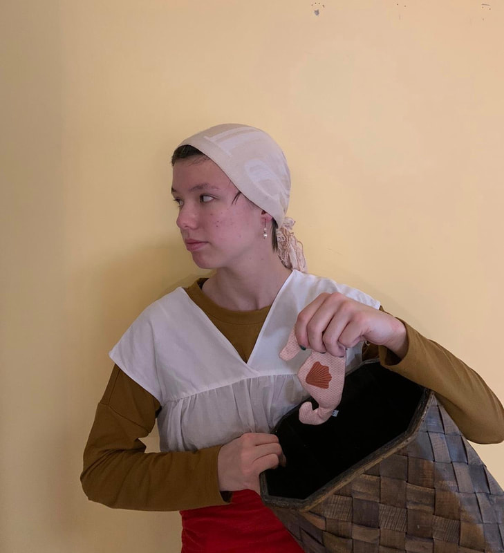
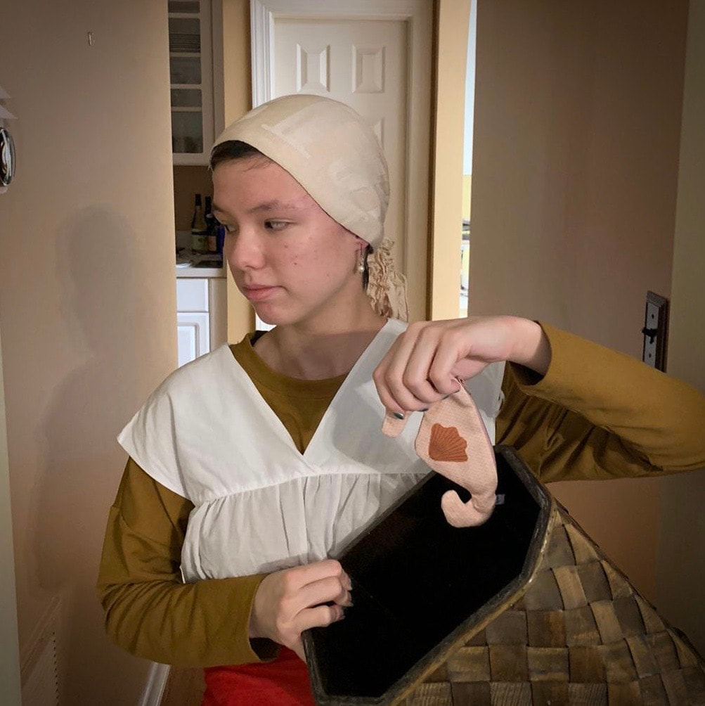
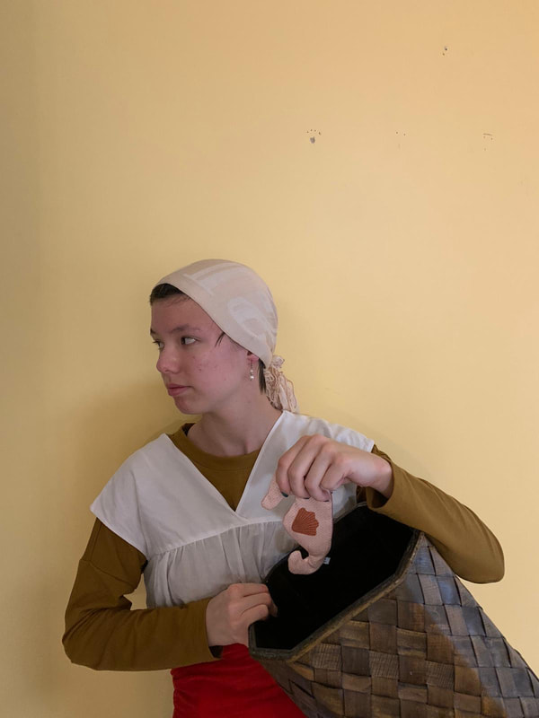
Title: Woman Selling Herring
Artist: Godfried Schalcken Date Created: 1675/1680 Size: 19 cm (height) x 15.5 cm (width) Medium: Oil On Panel
0 Comments
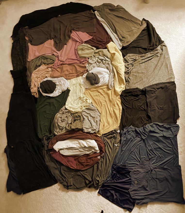
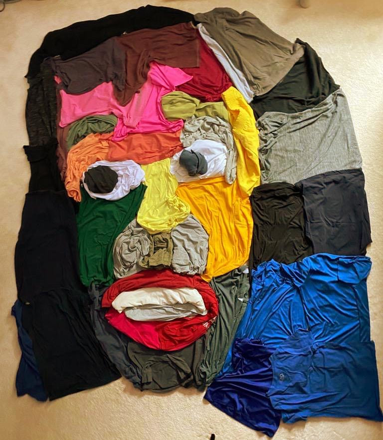
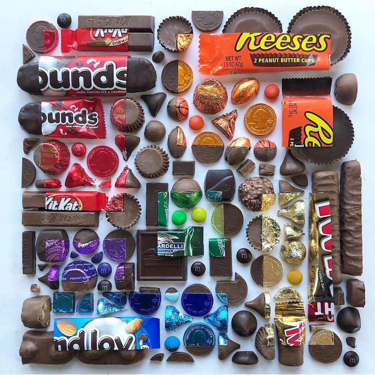
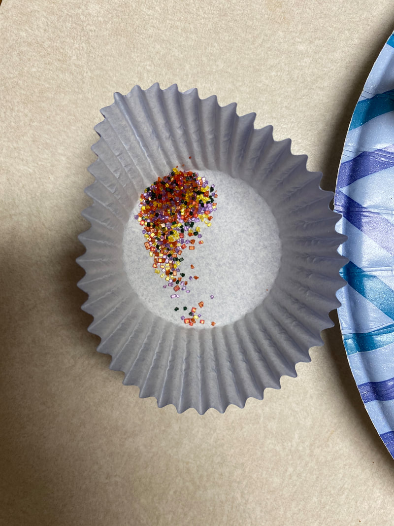
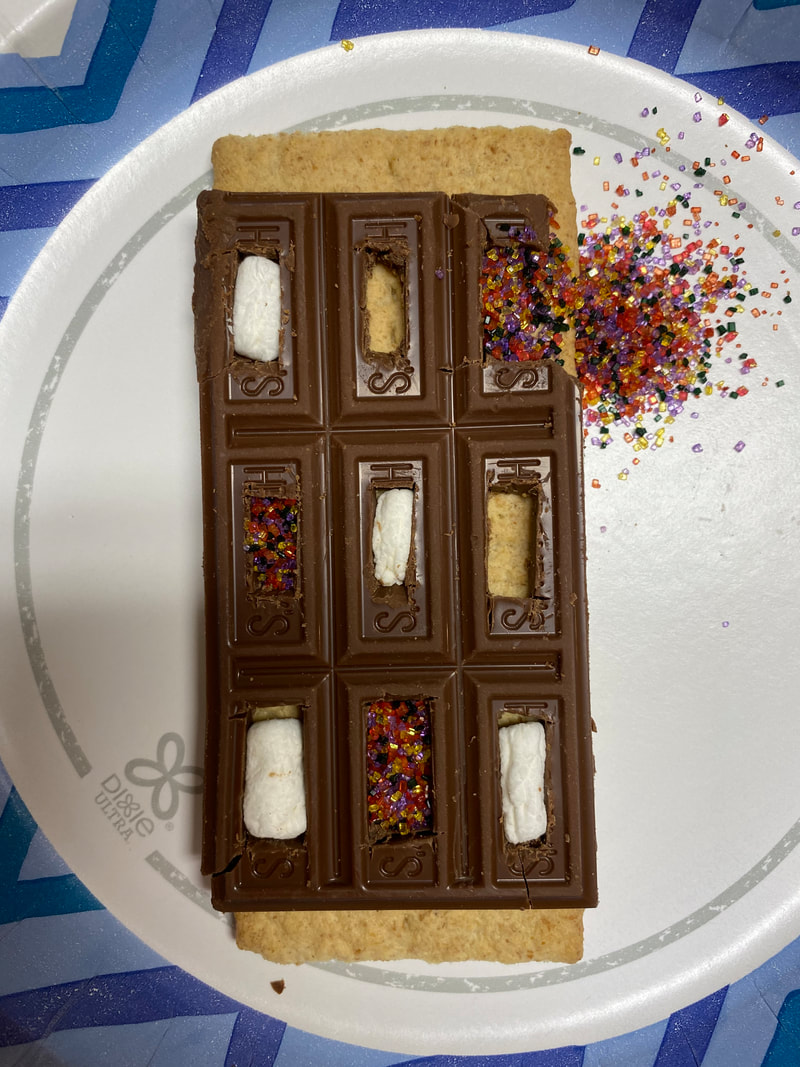
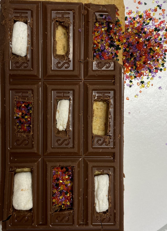
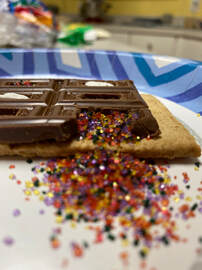
My piece is an arrangement of s'more ingredients and sprinkles. For this project I was asked to take a variety of objects and arrange them, modify them, an organize them to create a pattern or visual effect. To do this, I decided to use a chocolate bar as framework, and have other objects be arranged inside of the chocolate bar. I cut out squares inside of the individual chocolate pieces, doing my best to keep the remaining chocolate intact. I then put the cut chocolate on top of a graham cracker so that the cracker was visible through the squares I cut out. I then cut some marshmallows down in size, and mixed some different colored sprinkles in a cup. I then filled some of the holes in the chocolate bar with marshmallows and some with sprinkles. This created diagonal rows in the chocolate, one filled with sprinkles, one filled with marshmallows, and one filled with nothing to show the graham cracker below. In the corner box of my chocolate frame, I took away part of the frame and had the sprinkles inside spill out of the frame onto the plate to add some movement to my piece.
In my piece there is a lot of texture. I used many different materials, each with different tactile and visual textures. The chocolate was the material I used most since it acted as a frame for the other materials, and it has a smooth texture. Compared to the other materials I used, the chocolate reflected the most light, making it look silky and sheen. The sprinkles added a lot of texture to my piece as well, since the squares with them are filled with lots of individual crystals of sugar. This added some sharpness to my piece and also added a grainy texture. The marshmallows also contributed to the texture of the piece because I had to cut them into smaller pieces, and when pushing them into the squares in the chocolate, I created many creases and folds in the skin of the marshmallow. Pattern plays an important part in my piece because it is what mainly makes my piece interesting. Without having a pattern, my piece would look like a random assembly of different foods. I created a pattern within my arrangement by filling the separate diagonal rows in my chocolate frame with the same material, creating a row of sprinkles, a row of graham crackers, a row of marshmallows, another row of sprinkles, and a final row of marshmallows again. I was inspired to this by seeing photos of Adam Hillman's work. I particularly liked his photos where he arranged a bunch of objects and peels them in specific ways to create boxes or triangles of colors surrounded by a bunch of peeled or raw materials. This is how I got my idea for using chocolate as a frame to create boxes of different materials surrounded by a homogeneous frame. Because I have s'more ingredients in my house already, I decided to use those materials and added sprinkles to add my own touch to the arrangement. I find the design of my piece successful. I would have considered the execution of my piece successful, but cutting chocolate cleanly while keeping it intact was hard and I ended up breaking pieces in the first column of chocolate pieces so bad I had to cut the column off completely. I ended up with some cracks in my final frame and had a fair amount of chocolate crumbs on the frame I could not get out, making my final piece slightly more messy than I would have liked. However, I think the design I came up with looked very similar to how I wanted, and I think I achieved the effect I was looking for so I consider the design successful. From this assignment I learned that considering the properties of the materials you plan on using is important. I did not consider the properties of chocolate at room temperature when I started my project, resulting in many cracks and areas where the chocolate melted to my touch. If I had thought about the properties and characteristics of the materials before I used them I might have started my project at a different temperature or I might have used different materials that are more suited to my design.
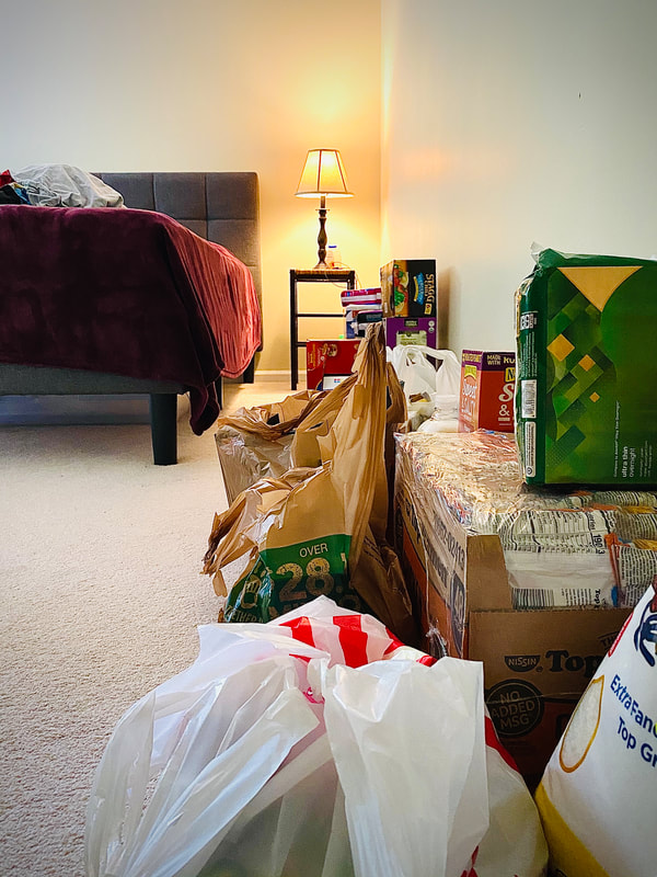
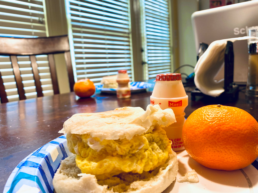
foodMy piece is a collection of three photos, taken during the COVID - 19 Pandemic. These photos are taken to show what my perspective is during the pandemic. They show what I am doing, eating, where I am going, etc. These photos utilize the rule of thirds to make them more interesting. The rule of thirds is a composition where an image is divided into thirds horizontally and vertically. Using the rule of thirds , the subject of the photo is placed along the lines dividing the image into thirds, or at an intersection of these lines to create tension and interest.
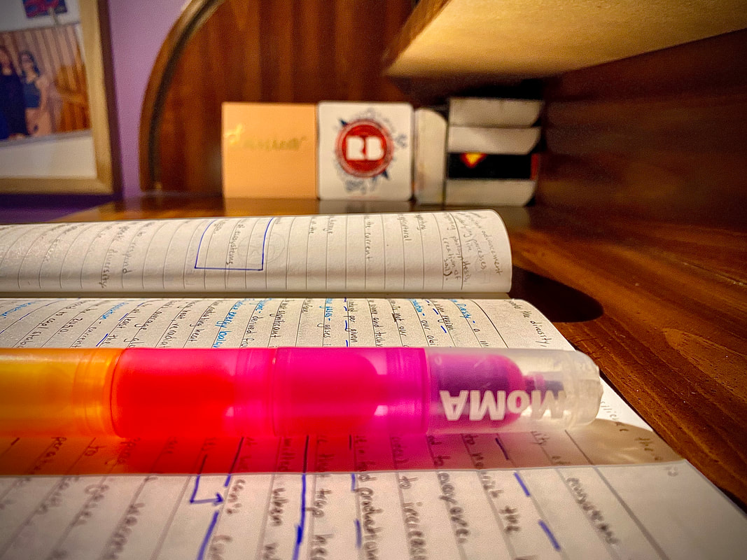
I used color in my pictures about the pandemic. I tried to use color to emphasize the objects of interest, and to highlight them even more. In the first picture, I tried to bring out the colors of all the boxes, bags, and food containers to bring attention to the variety of supplies people are keeping stock of during this time of panic. I also tried to bring out the yellow color of the light emitted from the lamp to lead the viewers eyes through the boxes to the source of light. In the second picture, I tried to emphasize the colors of the highlighter, and objects in the background, which both lie along horizontal lines following the rule of thirds. The surrounding colors are all neutral shades of brown and white, to bring attention to the highlighter. Emphasizing the color of the highlighter also created contrast to the words "MoMA" written on the cap, which hopefully draws the eye to the cap as well since it is placed along the intersection of some lines using the rule of thirds. Finally, in my third picture, I used color to emphasize the orange on the closer plate, and to emphasize the farther plate, which I wanted to bring attention to amidst all the brown, black and gray hues of the background. I used emphasis in my photos to attract attention to the objects of interest, which were all related to the pandemic going on. In the first picture I emphasized the boxes of supplies over the bed by having the boxes fill the entire line of sight on the right side, which the bed ended halfway down the picture, giving the boxes more weight and emphasis. In the second picture I tried to bring emphasis to the highlighter rather than the objects lined up in the background, even though both were on horizontal grid lines, by increasing the vibrancy of the hues to "outshine" the duller objects in the background. In the third picture I tried to bring emphasis to the plate of food in the foreground by emphasizing the shadows and highlights of the food on that plate, giving that food more depth than the food in the background, and by focusing on the plate in the foreground when taking the picture to focus on the details in that plate. My idea behind this piece was to show how simple my life in quarantine has been by showing objects that I use frequently now that I am stuck at home. I was inspired by Jeffrey P.'s photos, where he took a picture of his toilet paper stock at home. This inspired me to show the changes in my own house. I spend most of my time reviewing notes for my AP classes, so I took a picture of my notebook and highlighter, at the desk I spend most of my time at. That picture showed the environment I had been in more than usual, and what I am doing in this environment. The picture of my lunch was meant to show the simplicity of the food we are eating now that there are less items in stock in grocery stores and we are trying to conserve food by not making complex, elegant, and time-consuming dishes. So I took a picture of a simple egg on bread sandwich, an orange, and yogurt drink. I also tried to show the paper plate I was using instead of a plate that has to be washed afterward, because using paper plates is part of my routine now that we are stuck at home and using dishes more frequently. I find the emphasis in my photos successful. I think in my photos I was able to attract attention to the object(s) of interest through different techniques such as editing the values of colors, or through strategic placing. While doing this assignment, I learned a lot about the rule of thirds, and how placement in a photo is important. When doing this assignment, I would take multiple photos of the same thing, but from different angles. I saw that even a slight difference in where the shot is taken from can result in one photo being clearly better than the other. Using the rule of thirds really helped me bring emphasis to the objects I wanted.
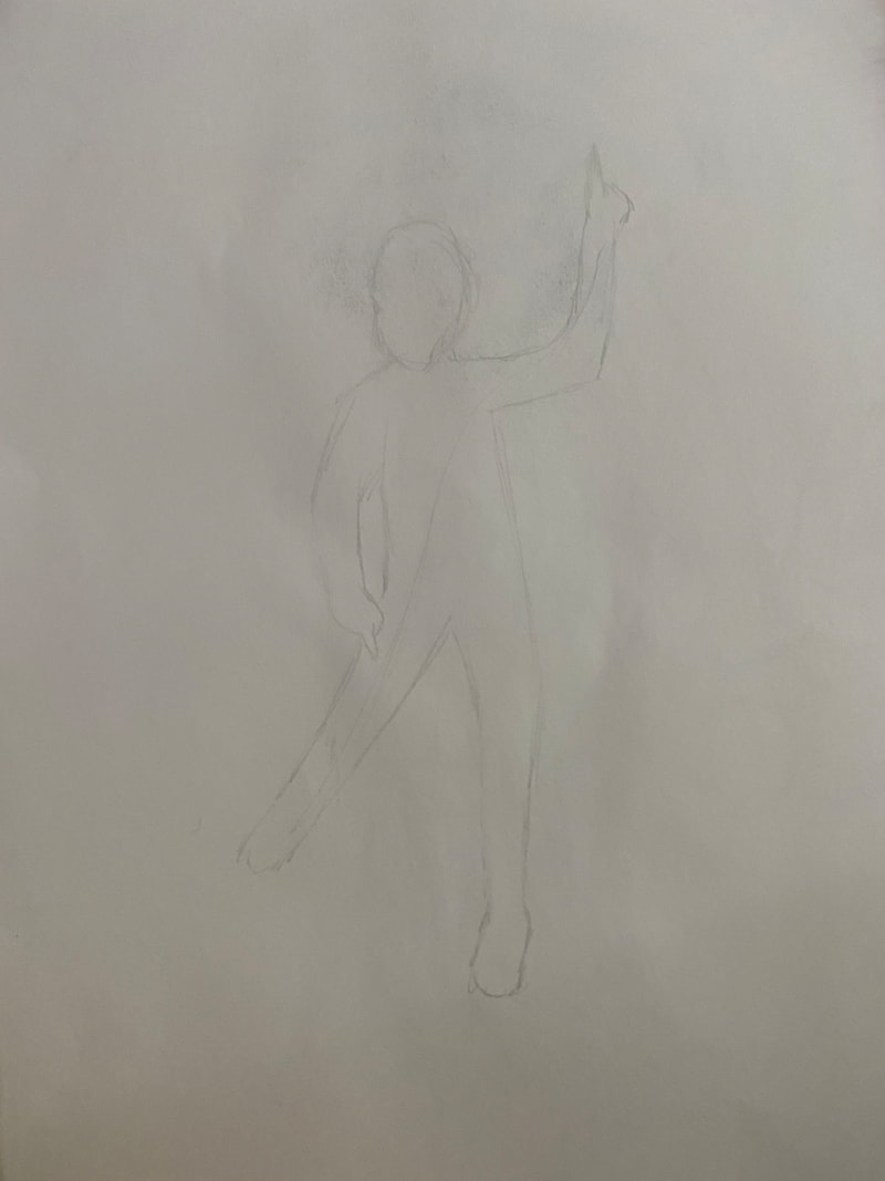
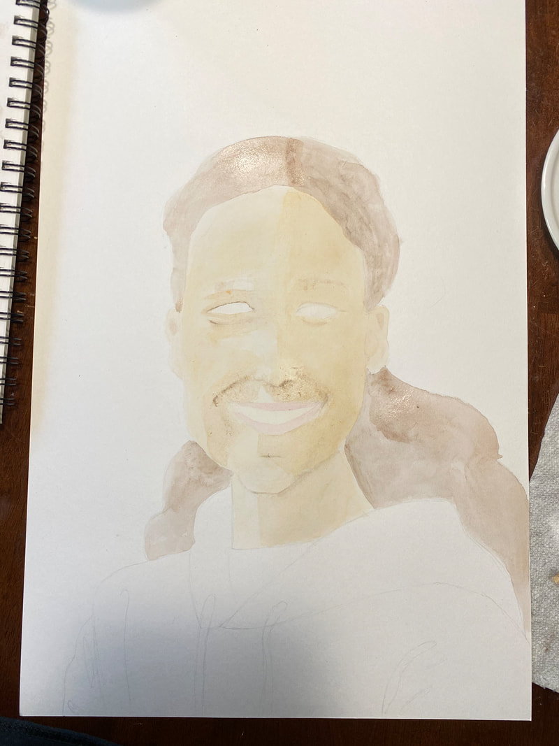
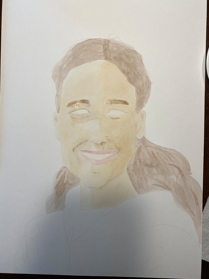
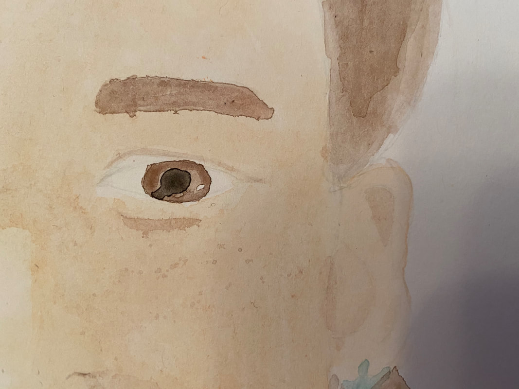
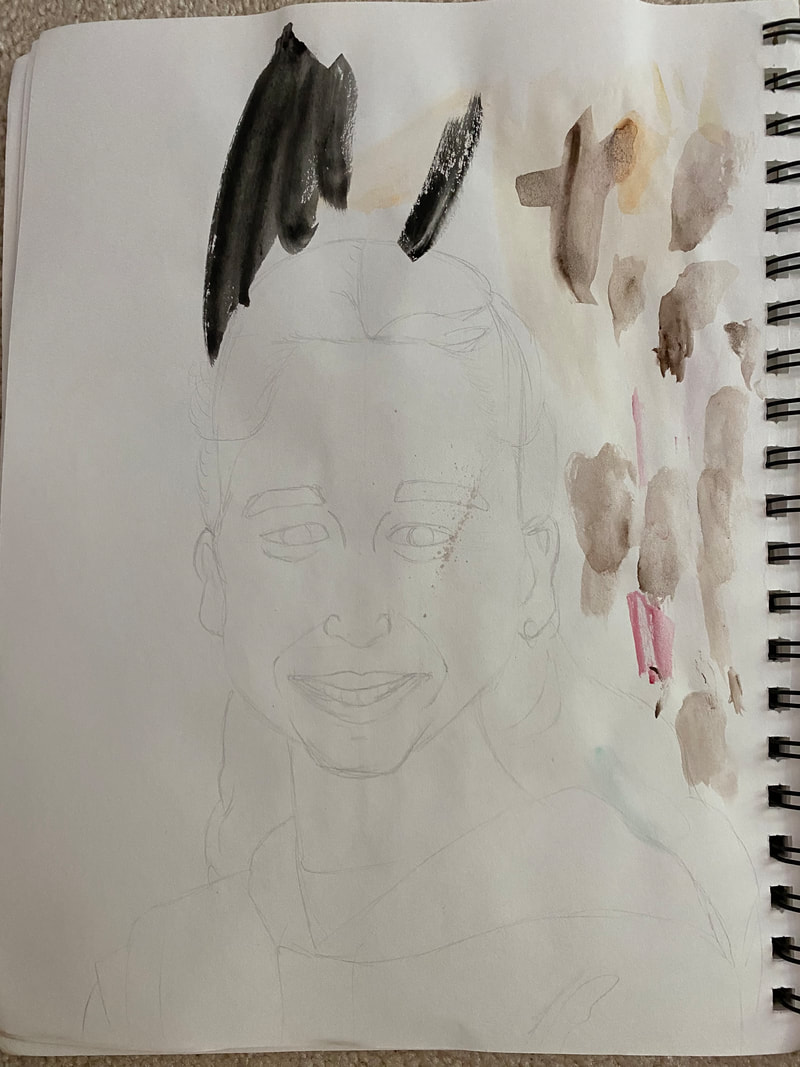
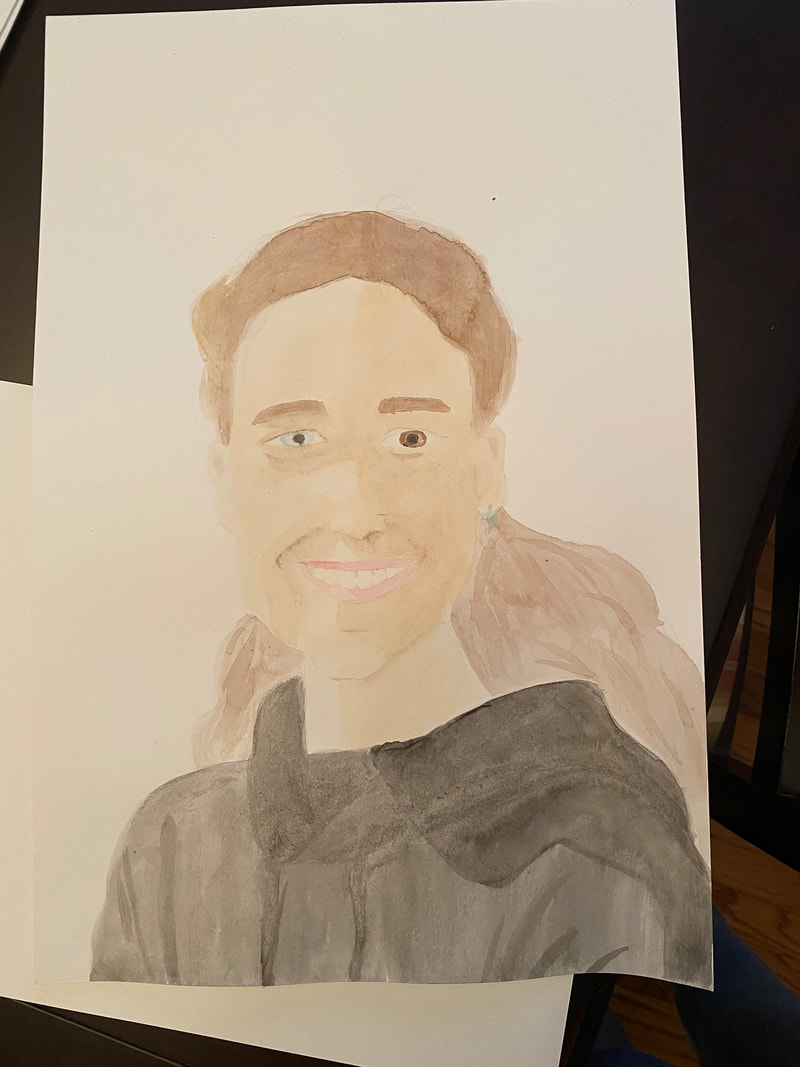
My project was a watercolor painting of my friend Sophie. I painted Sophie's face and part of her torso. In my painting, Sophie has turned her head to look at the viewer, which has cast the right side of her face in shadows. Watercolor is a paint that is thinned with water to create a transparent color.
In my project I used value to give Sophie's face depth. Value is the relative lightness or darkness of a color. I used differences in value when painting the skin tones of Sophie's face. The right side of her face has a darker value than the left side. This gradient of value helps show the contour of the face. There are even darker values of Sophie's skin tone in some creases in her face, like where her eyelid and dimples are. These darker values help distinguish different depths of her face. I used proportion in my project to make sure the subject looked as realistic as possible, by keeping the proportions of the face realistic. The face is about five eye-lengths wide, and the eyes are centered in the face. The bottom of the nose is about a fourth of the way up the face, and the corners of the subject's mouth end about halfway through the subjects eyes. By making sure parts of the face were proportionate to other parts, I have created a face that looks proportionately realistic believable. For this project, I was inspired by my friend's eyes. The friend that I painted has different colored eyes, and a unique shaped pupil, and wanted to emphasize that uniqueness by having her look at the viewer since eyes are naturally already centered on our heads. So I decided to paint her looking at the viewer while having her body face a slightly different direction to place more emphasis on the head. My piece emphasizes the subjects eyes by placing them in the middle of the paper, and through my choice of colors. The subject's right eye is more vibrant than the other brown's in the painting, drawing attention to it. The subjects left eyes, which is blue-green, is accented by using neutral colors throughout the painting and for the subject's clothes. I find the right side of the subject's face, the one in shadow, successful. I believe the brown eye achieved more emphasis that the green one, and the ear on this side of her face has more depth. The left side of Sophie's face was harder to paint because it was not covered in shadows and only had a few in certain areas. I learned a lot from this project. The main thing I learned was to be patient when layering up the painting. I learned it was important to let all the paint dry before adding more, because watercolors tend to dry a lighter color. I learned that by slowly adding on more paint, it is easier to paint shadows and creases in skin, than painting different hues on from the start. I also learned the importance of having proper paper. I accidentally used the wrong type of paper because of a small misunderstanding, and when I was painting, the paper kept peeling off from all the watercolors, making it hard to blend and achieve fine lines.
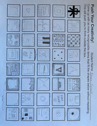
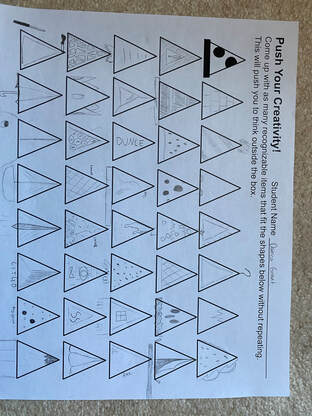
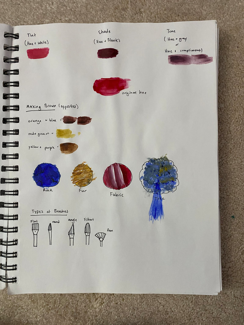
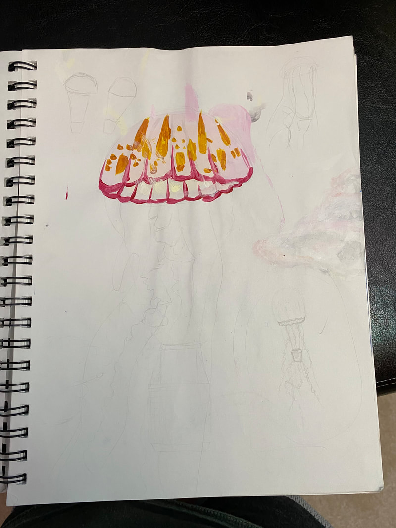
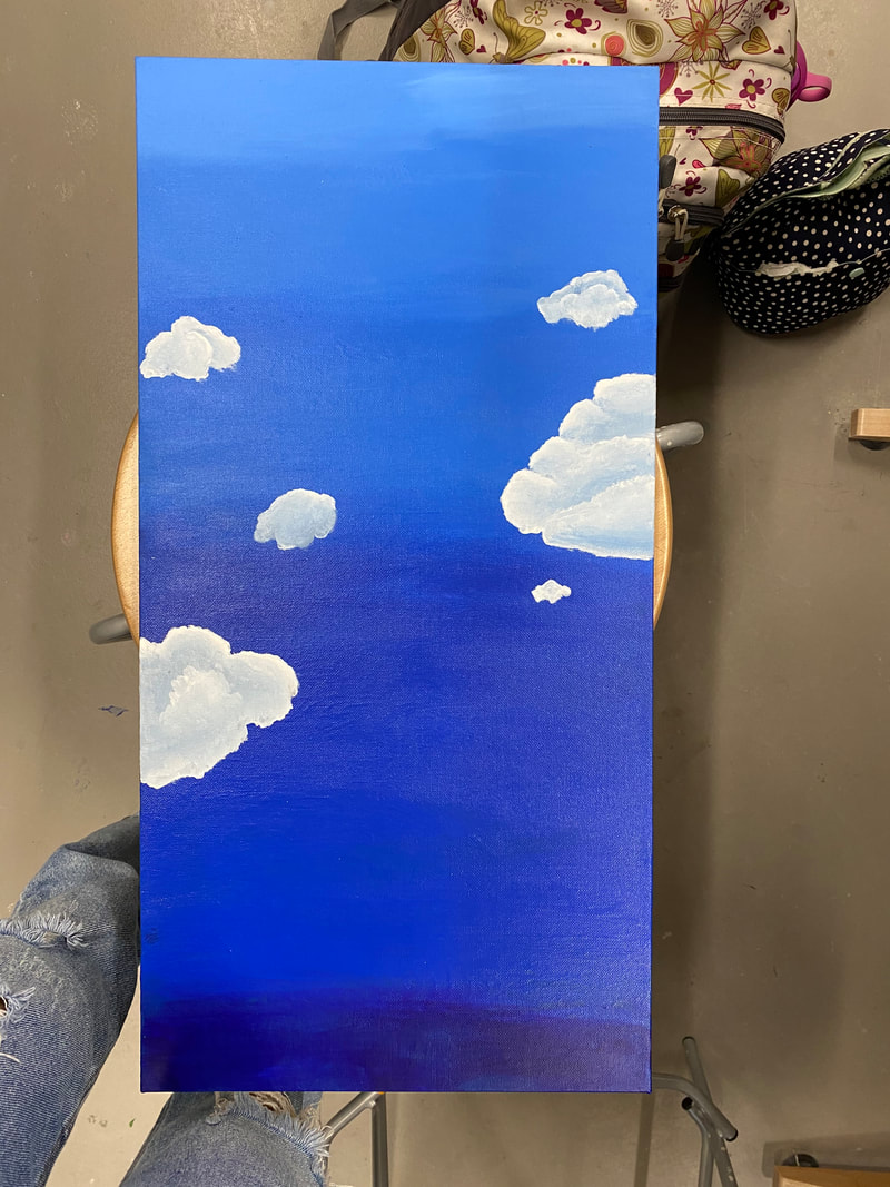
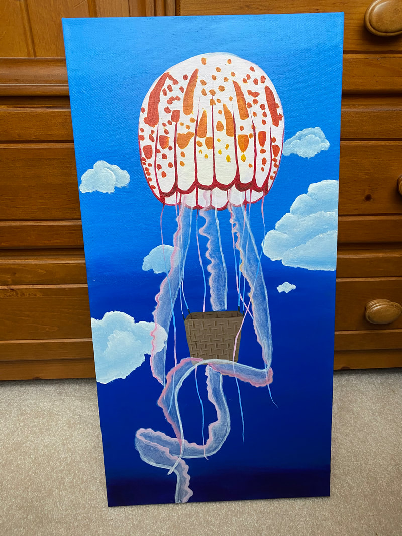
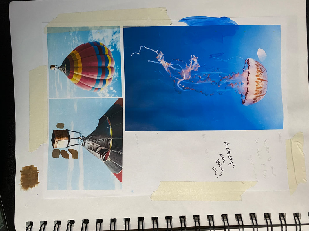
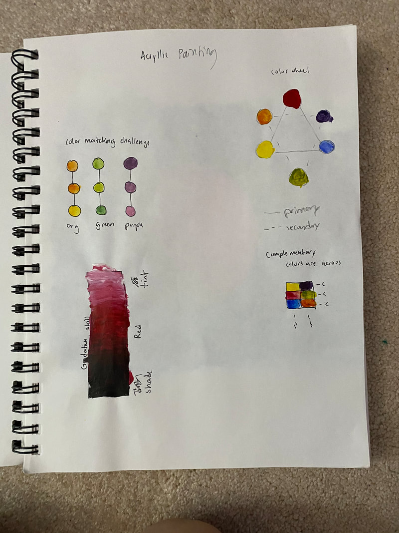
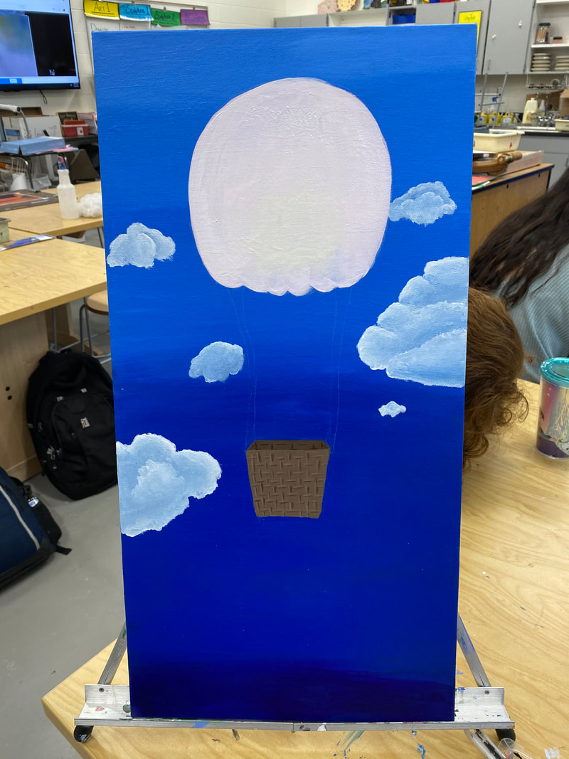
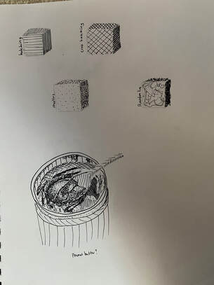
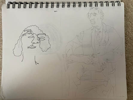
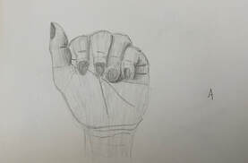
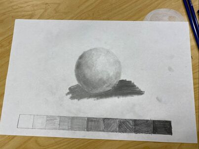
Warm Ups:
|

 |

Author
I started taking Art seriously in Eighth Grade when I took a Character Design Class.
Archives
May 2020
April 2020
March 2020
February 2020
January 2020
 RSS Feed
