 Description:
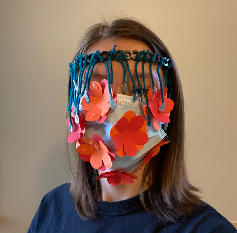
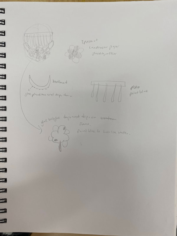
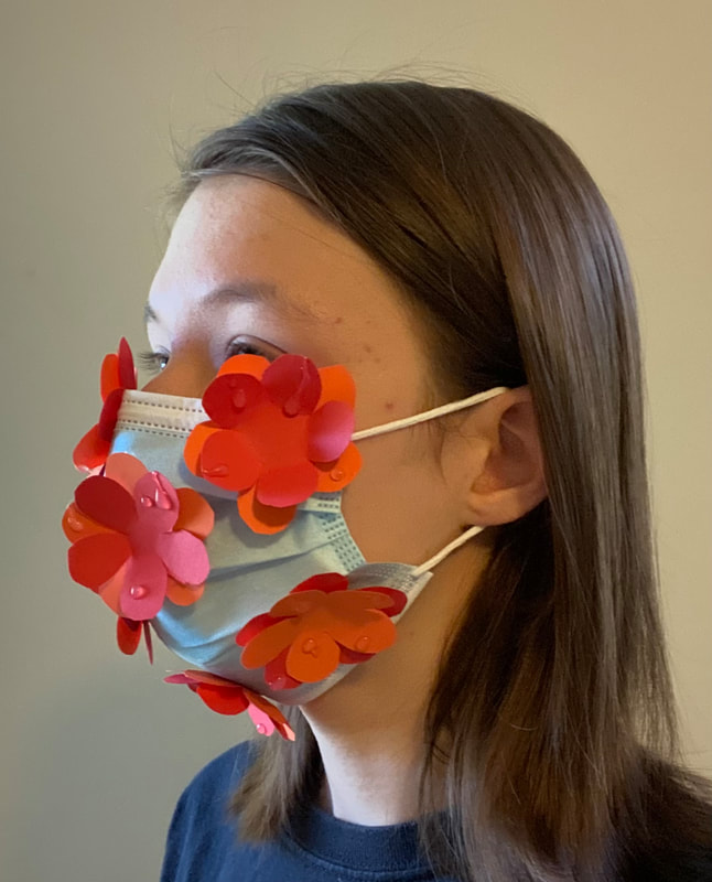
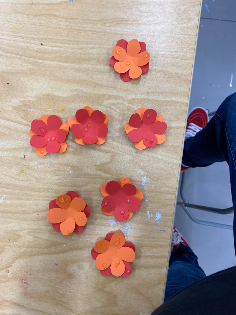
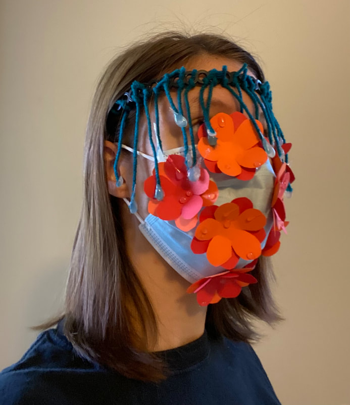
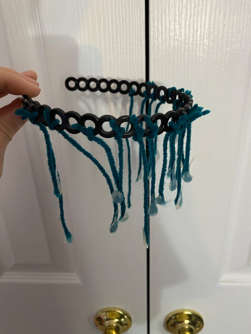
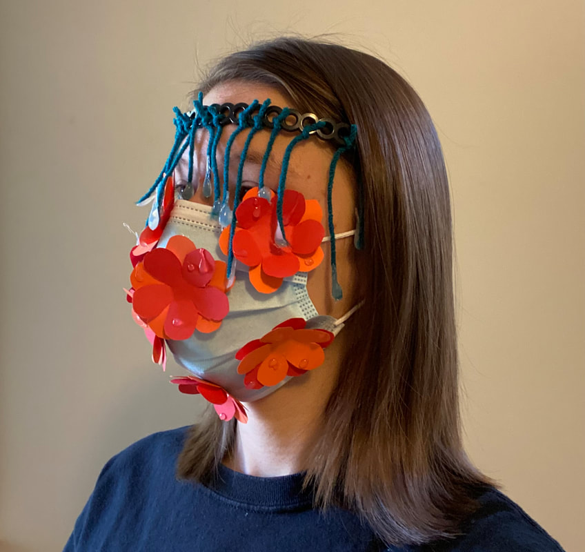
My piece consists of a facemask, and a headpiece. The face mask consists of construction paper flowers flued onto a blue face mask. The flowers are made of two layers: a red layer with five petals, and an orange layer with five petals. Which layer is on top is different for each flower. The flowers also have drops of hot glue dried on them, to look like raindrops. There are seven flowers glued at random onto the mask. The headpiece consists of a black headband that is worn around the forehead. There are drops of hot glue in the shape of rain drops tied to the headband with blue yarn, so that they dangle in front of the face. The raindrops are suspended at different heights. Interpretation: I believe that my piece creates a feeling of tranquility in the viewer. The piece is intended to act like raindrops falling on the flowers below. The bright colors help this scene seem more peaceful than frightening like a thunderstorm. Whenever it lightly rains, I often feel calm. I often feel calm in nature as well, and I hope seeing my piece will remind the viewer of times like these, and make them feel peaceful and tranquil. Analysis: I think my piece is pretty cohesive. The flowers are all consistent colors, and all the raindrops were made the same way regardless of whether they're on the flowers or hanging down from the headband. The only part of this piece that I feel is not visually cohesive, is the string that the raindrops are attached too. The string is thick and a dark blue that doesn't appear anywhere else in this piece. Additionally, the thick yarn makes the raindrops have a heavy visual weight, instead of being light and peaceful like I intended. If the strings were clear and thin, then the piece would probably be more cohesive and visually balanced. Judgement: I feel like my piece was successful. I think that everything I made was recognizable. The flowers look like flowers, and the water droplets look like water droplets, and the raindrops are all in the shape of raindrops. I think the strings may confuse some viewers, but overall if you look at the piece for long enough it's clear what each component is.
0 Comments
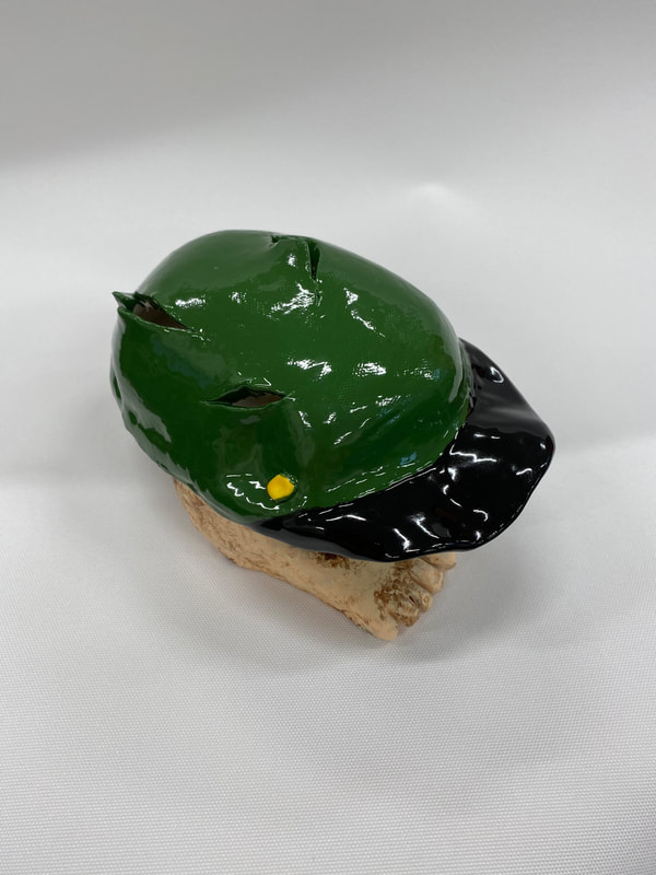
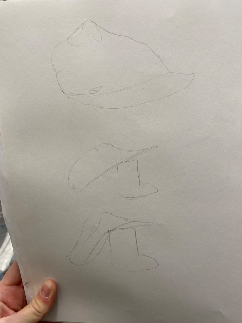
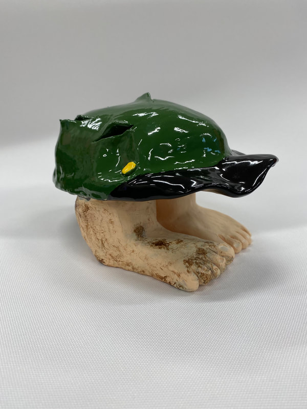 I found the glazing of the hat to be the most successful part of this piece. I chose to glaze the hat green with a black brim to match the hats I saw in the piece I was inspired by. This is also why I glazed the button yellow - to match the golden button in the painting. I glazed multiple layers and the colors came out heavy and bold, which I thought really drew attention to the hat, and made it look like a very finished piece. The colors also really helped tie my piece to the painting from the NCMA.
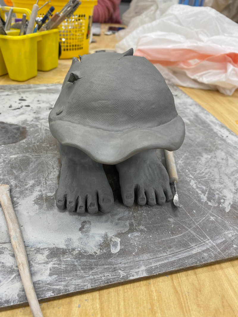
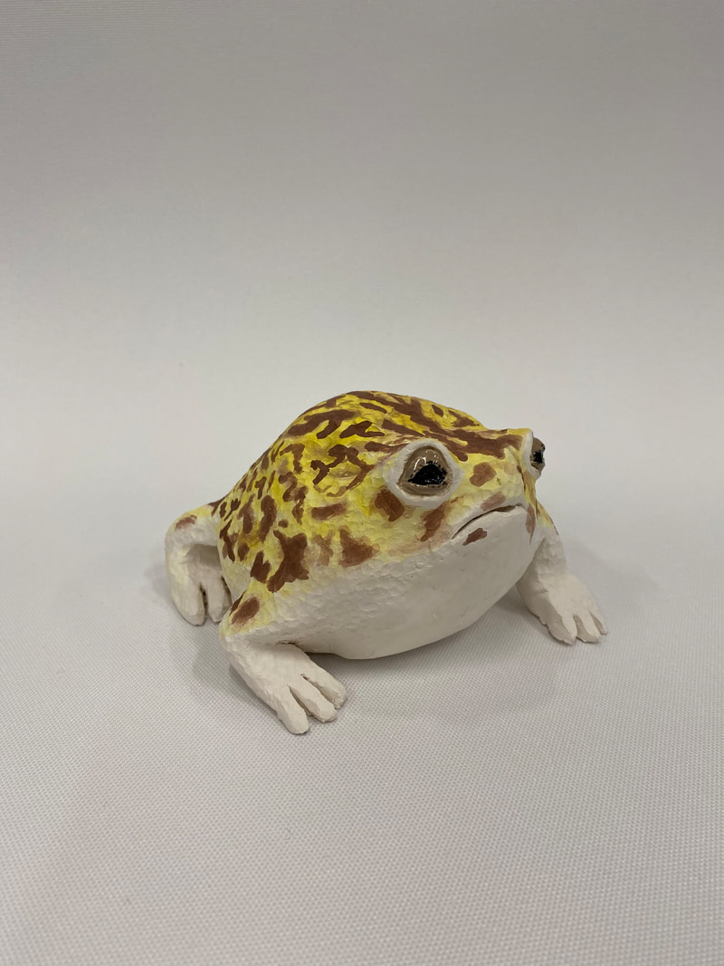
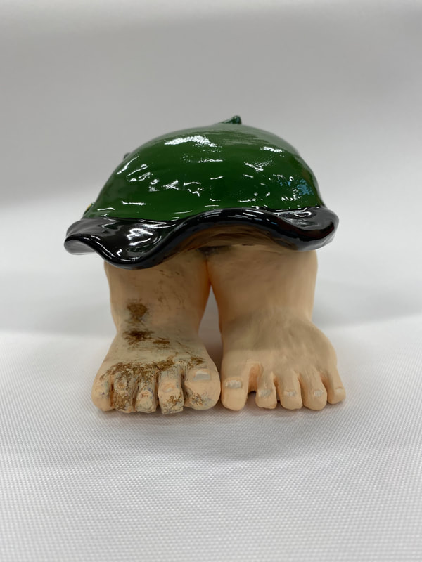
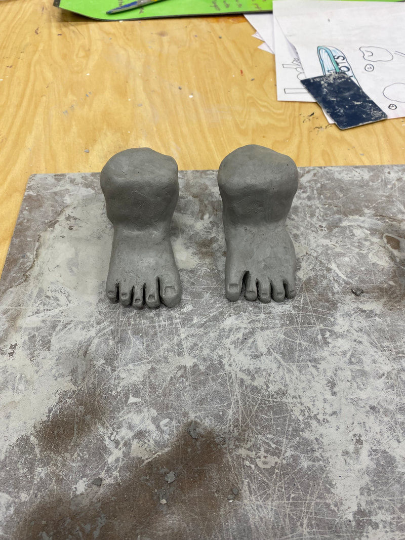
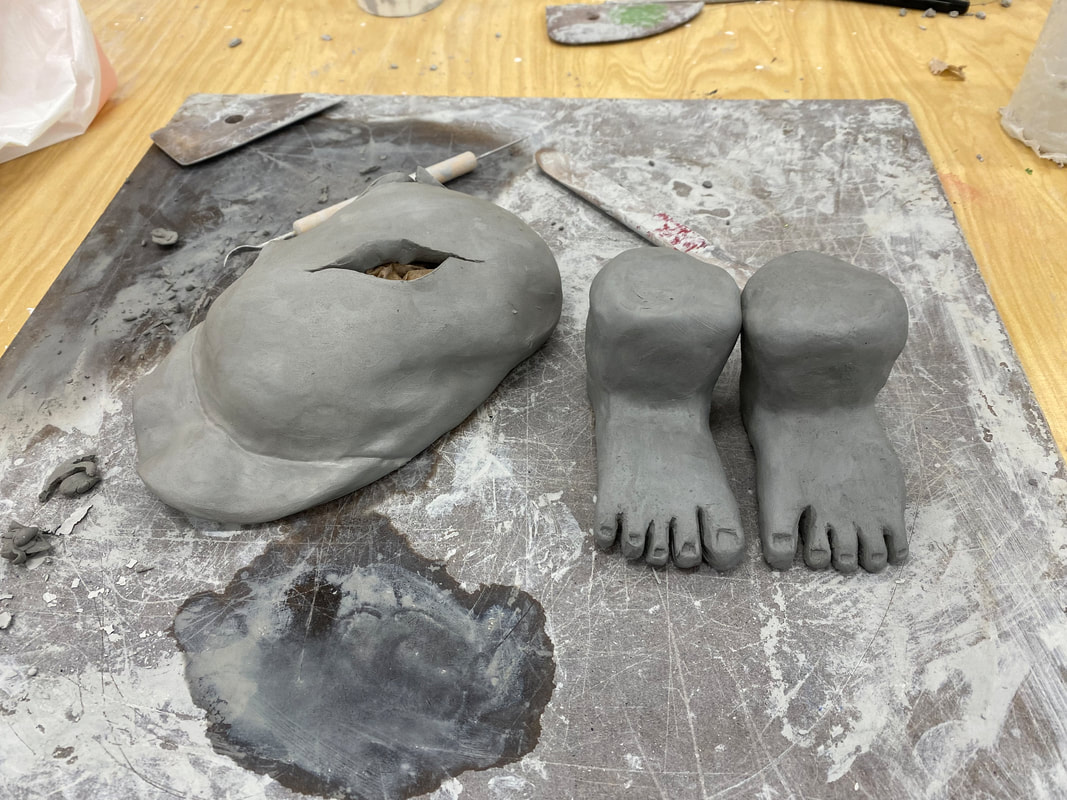
If I were to do this piece again I would try to paint the right foot differently. I was trying to paint dirt on the foot, but the texture doesn't look quite right. If I were to do this piece again I might try and use different techniques to get the right texture. I might use a sponge, or some sort of hard bristle brush. When I was painting/glazing this piece, my goal was to match the hat I saw in the NCMA painting. I tried to find glazes that matched the colors, and I then focused on doing multiple, even layers to make sure the color really came through and no white clay was still visible. When painting the feet I decided to paint one foot dirty and one foot clean. I wanted this to represent having one foot in the past, and living in a poorer condition, and on foot in the future, living in a cleaner, more stable situation. Once I had mixed a skin tone color I painted both feet and then mixed a brown color and tried to paint the right foot dirty. But I was unhappy with the results and decided to paint the right foot over again with the skin color paint. I then attempted to paint on the dirt again, and was more satisfied with the results! 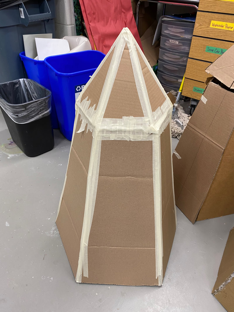 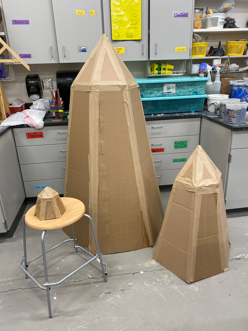 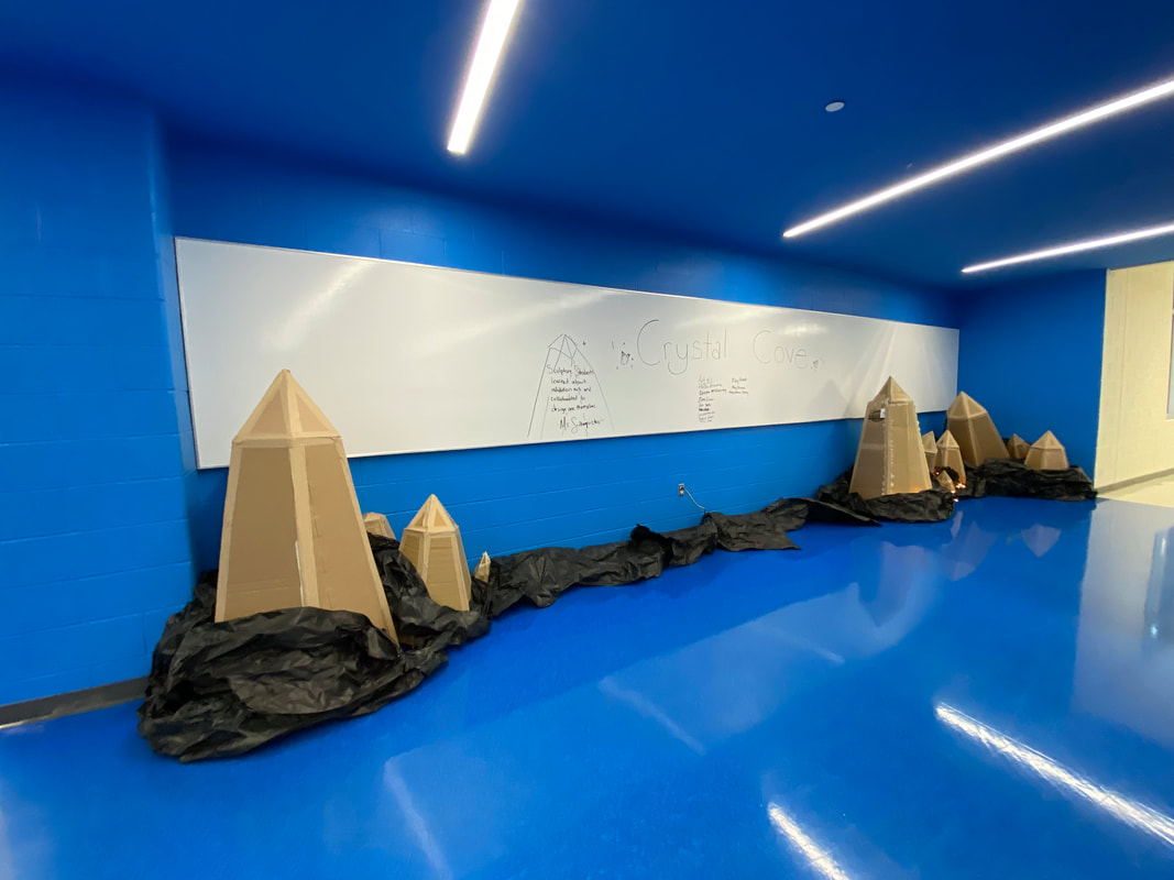 In my group I worked with Jessica to cut out the pieces for the medium and large crystal. Together we taped the pieces together and applied the brown tape over the edges of the crystal. We also applied the brown tape over part of Asia's small crystal. Additionally, Jessica and I helped gather and place the black paper in the installation, and set up the left side of the installation. We also put the lights in the installation. Asia was the other person in our group and she made the small crystal!
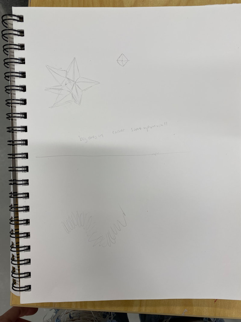
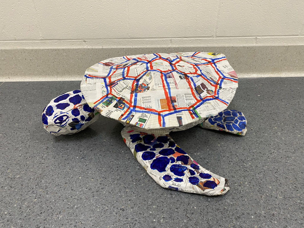
I find the scale of this piece successful. I think having large, human-sized crystals really makes the piece immersive, and it helps feel like the crystals are really growing out of this large school building. I also think having different sized crystals helps make the piece seem more realistic and recognizable. If I were to do this installation again, I would have added more lights and possibly painted the crystals to add color and make them even more recognizable. I would have also made more crystals on the left side come out at angles, because that form really helps make the crystals recognizable.
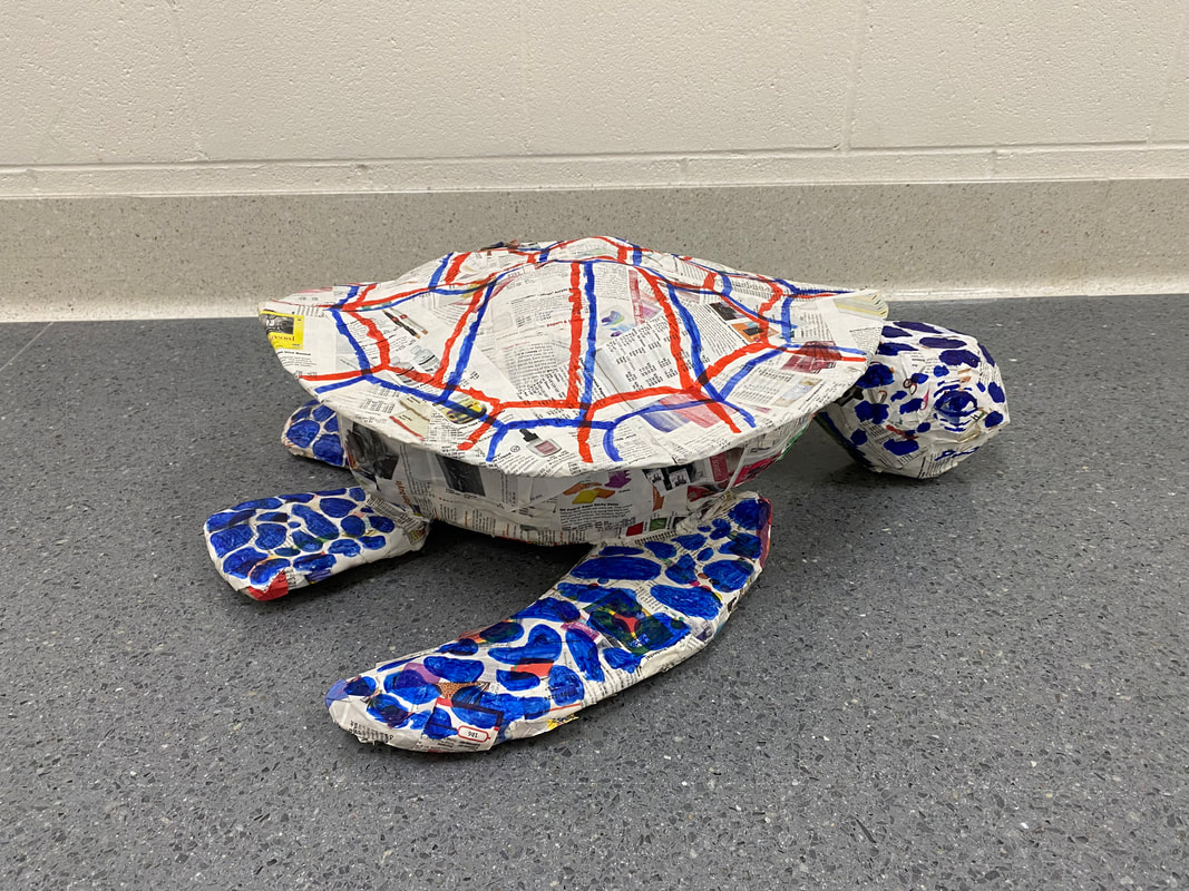
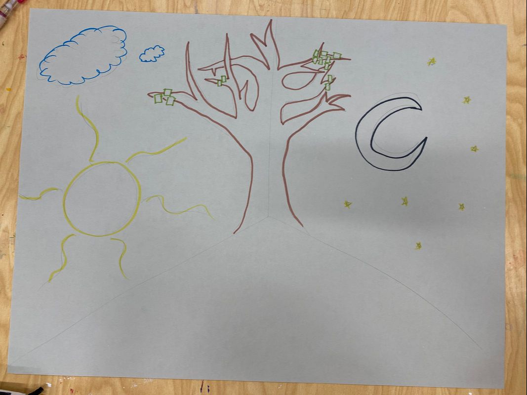 My table’s idea is to take the canvas paper, and cover the corner of a room or collaboration space with it. We would then paint the paper so that one side of the corner had a sun, and a daytime scene, while the other side had a moon, and a nighttime scene. In the middle of the two scenes, on the corner, would be a bare painted tree. Students could then use green sticky notes to interact with the piece. If they were having a good day, they could share something good happening in their lives by writing it on a sticky note and putting it on the tree (like a leaf) on the daytime side. If they were having a bad day they could rant about it and put the sticky note on the night time side.
 Describe:
What do you find successful about your piece and why?
 What do you find successful about your piece and why?
    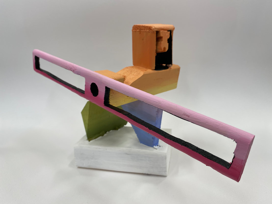 How did you utilize positive and negative space in your piece?
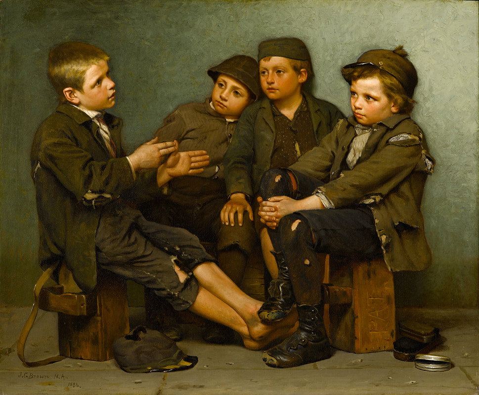 Title: A Tough Story
Artist: John George Brown Date When Made: 1886 Size: 25 x 30 1/8 inches Medium: Oil on Canvas What did you see in the piece? In this piece I saw a group of friends recounting a story and using their imagination to immerse themselves in a life better than their own. I saw a group of friends in a poor situation in life, with run down clothes that don't fit, dirty bodies, and tired expressions on their faces. But I also saw their thoughtful expressions and in this piece I saw them trying to escape the reality of their lives by thinking about other things. Why did you choose this piece? What drew you to it? I chose this piece because I loved the composition. I loved the poses the boys are in and how they're all all so close together with so many defined movements such as the the hands and outstretched legs of the boy on the left. I was drawn in by the boy on the right holding his knee in a position that seems uncomfortable, and I was drawn in by the friendship I saw through the boy leaning on his friend's shoulder, who has a comforting hand on his knee. The dynamic and motion in this painting drew me in. I was also drawn in by the detail and texture. I originally thought this piece was a photograph, and when I began looking closer, I was fascinated by the details in the textures and rips of the clothes, and the detail in the wood the boys sat on.
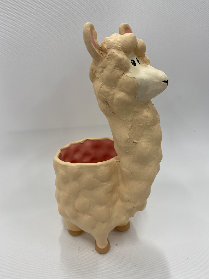
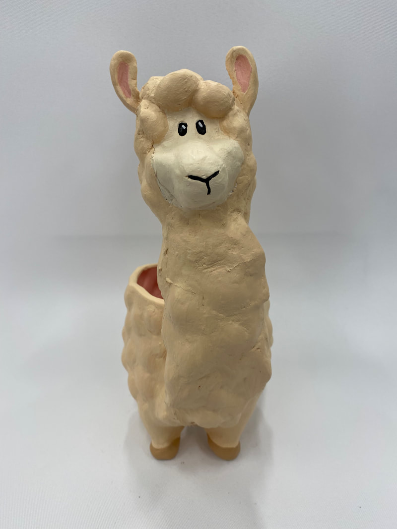
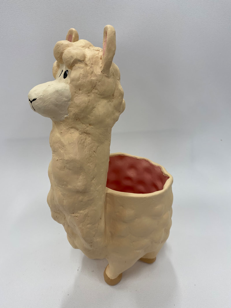
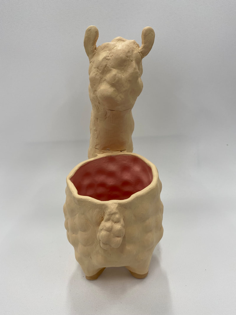
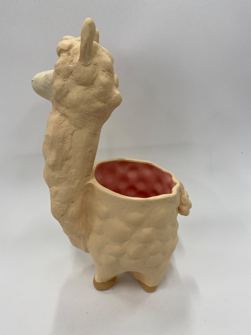
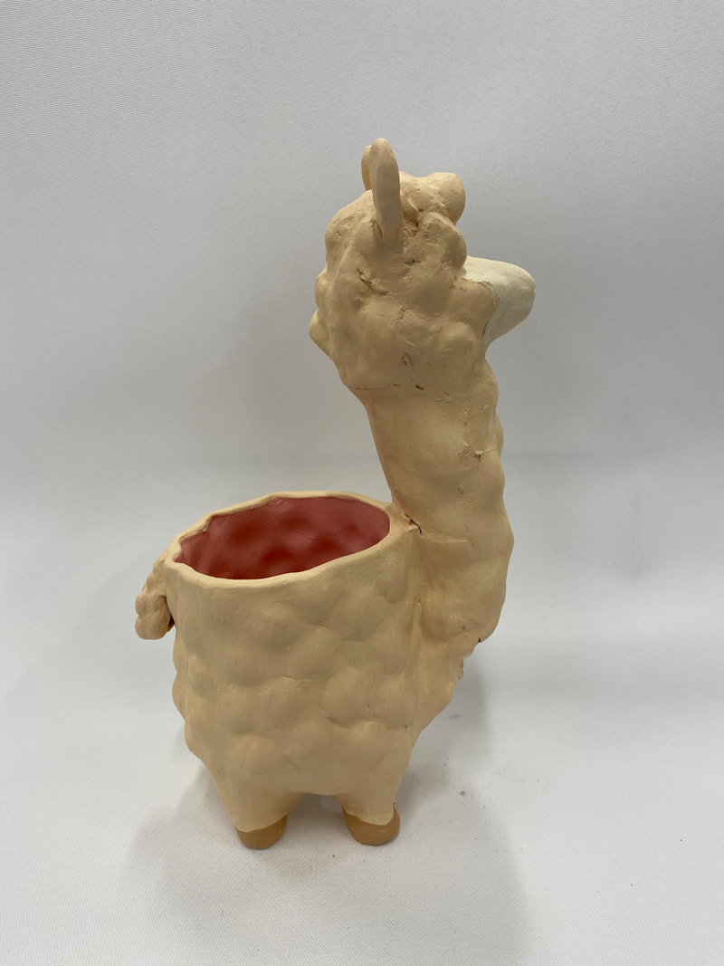
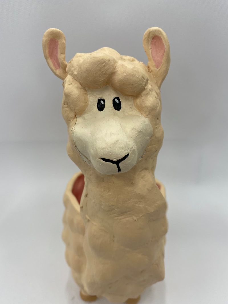 I found the painting process of my piece to be successful. I believe I was able to mix a paint color close to the color of llamas' fur. I also believe that using a lighter color for the face and painting on hooves really brought the structure of my mug to life, and gave my mug more resemblance to a llama. I also think that I chose a good color for the inside of my mug. I wanted a soft color to compliment the cute appearance of my mug, and I think choosing pink to match the ears of my llama worked out really well!
If I were to create this piece again, I would have glued together my mug differently. When my mug exploded in the kiln I used hot glue to put the pieces back together. However, I didn't take enough time mapping out where each piece connected before hand, and ended up not being able to insert pieces I had because I glued my mug together in the wrong order. I also could have applied to glue more neatly so that the seams wouldn't have been as visible. To finish off my mug once it was fired in the kiln, I started by gathering all the exploded pieces and using hot glue to put the pieces back together. Once the mug had most of the pieces glued back together, I used a concrete powder and water mixture to fill in the remaining holes. I did this by using my finger to apply blobs of the mixture to the holes, covering them. I then let my concrete dry over time and used sandpaper to smooth out the concrete. Finally, I used acrylic paint to color my mug and really bring it to life! I painted the entire mug except the inside and face one color, and then added paint to the same mix of paint I used for the body to create a lighter and darker tone that I would use for the face and hooves. I mixed pink paint to use for details in the ear and the inside of the mug. |
AuthorWrite something about yourself. No need to be fancy, just an overview. Archives
January 2022
Categories |
 RSS Feed
