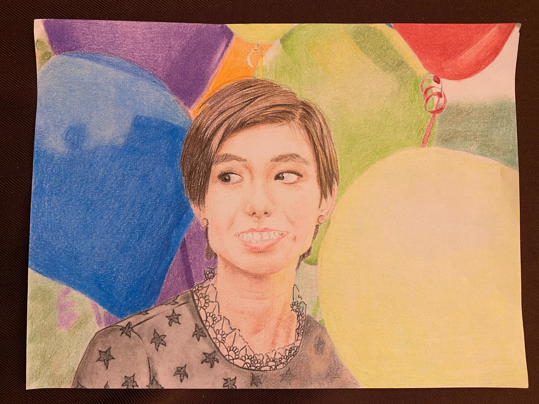
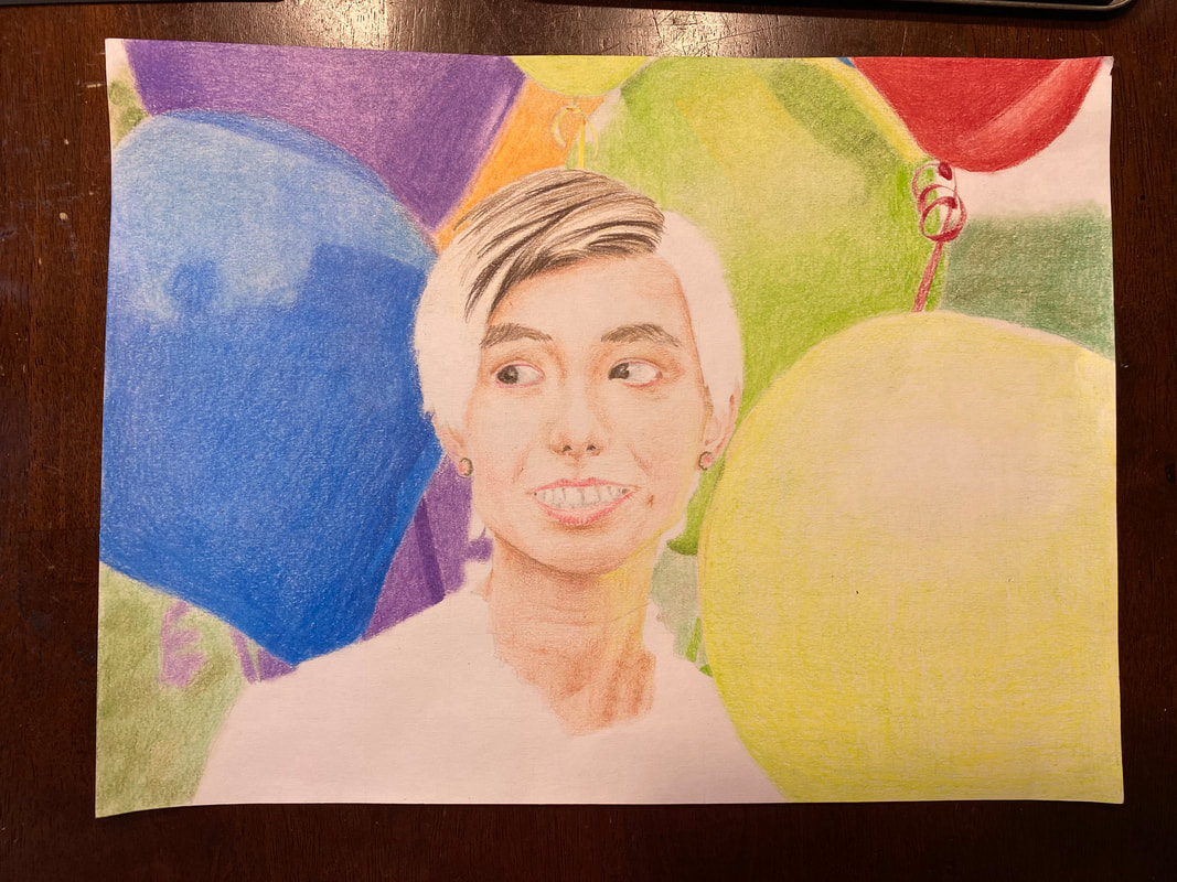
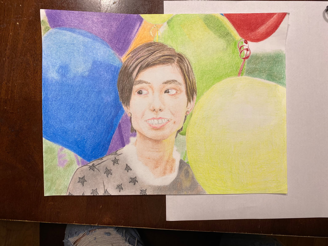
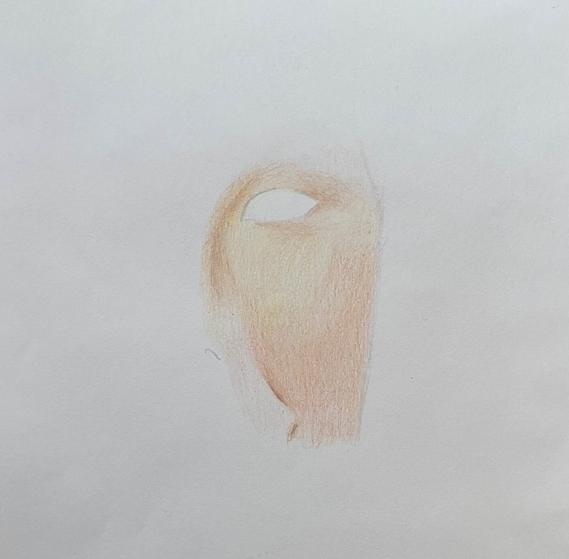
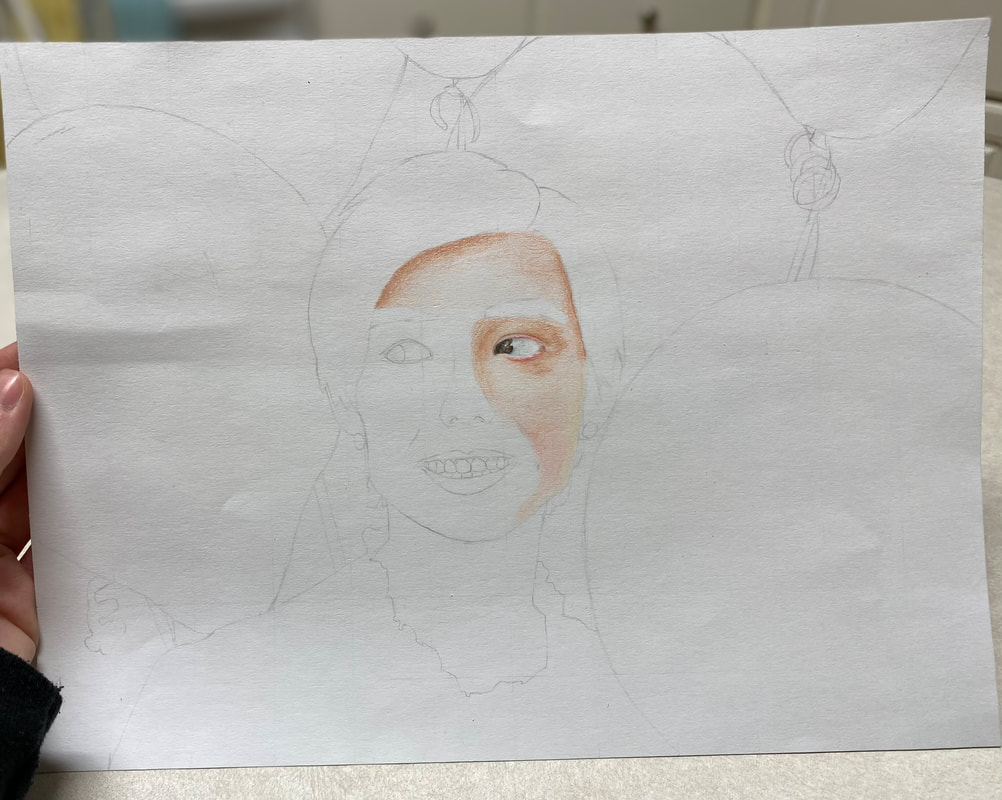
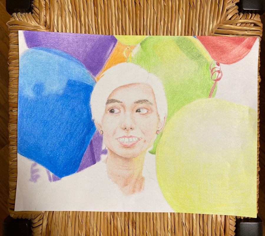
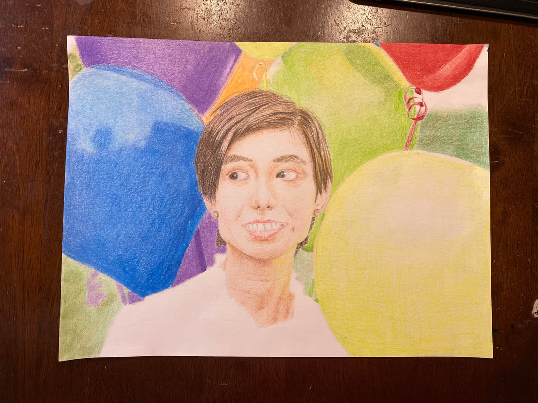
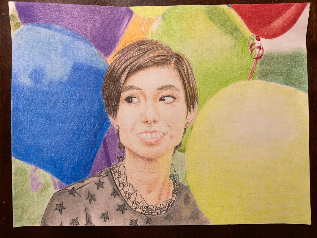
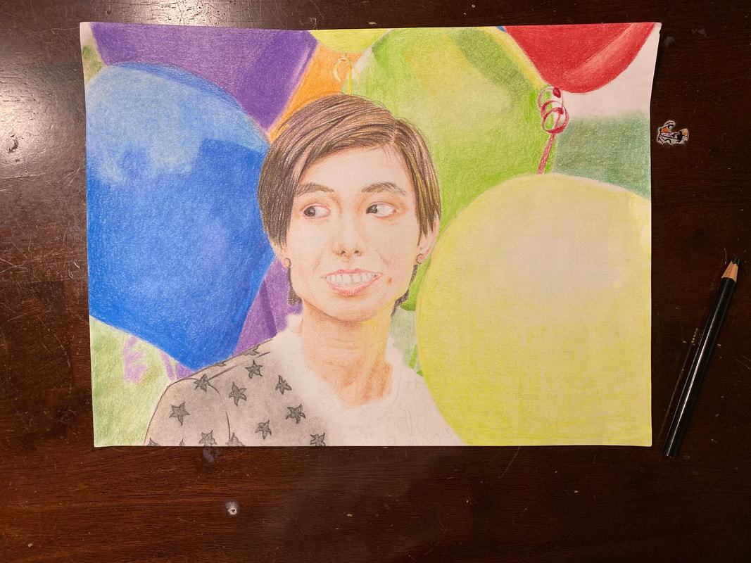
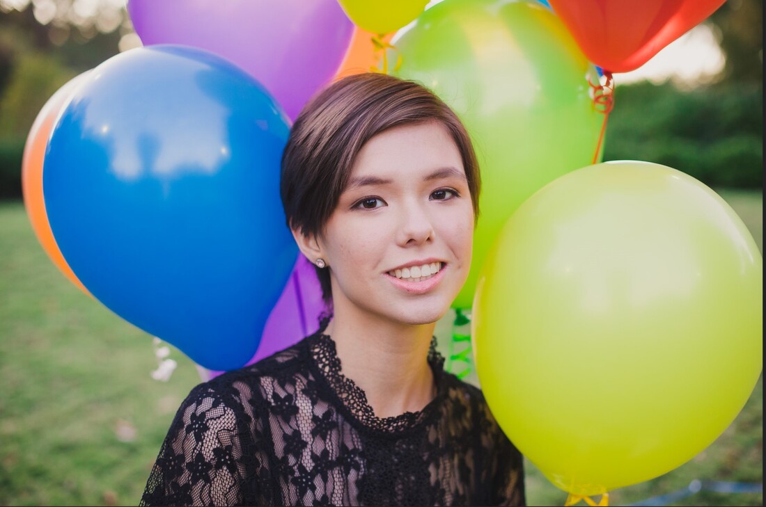
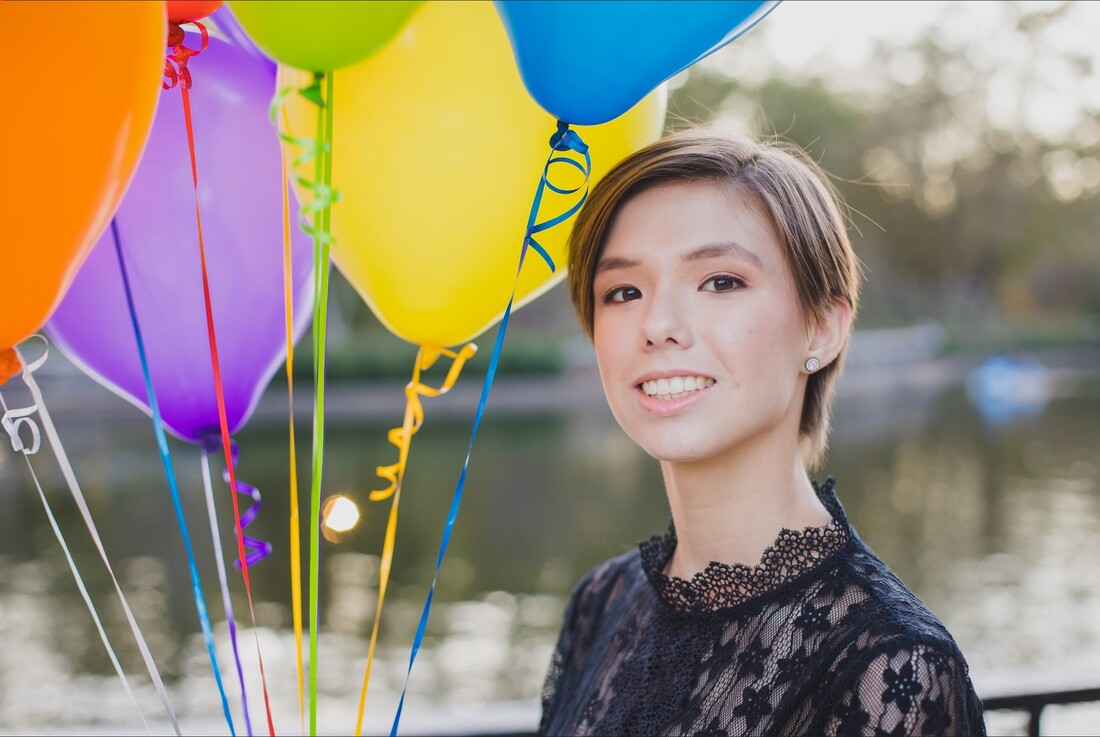
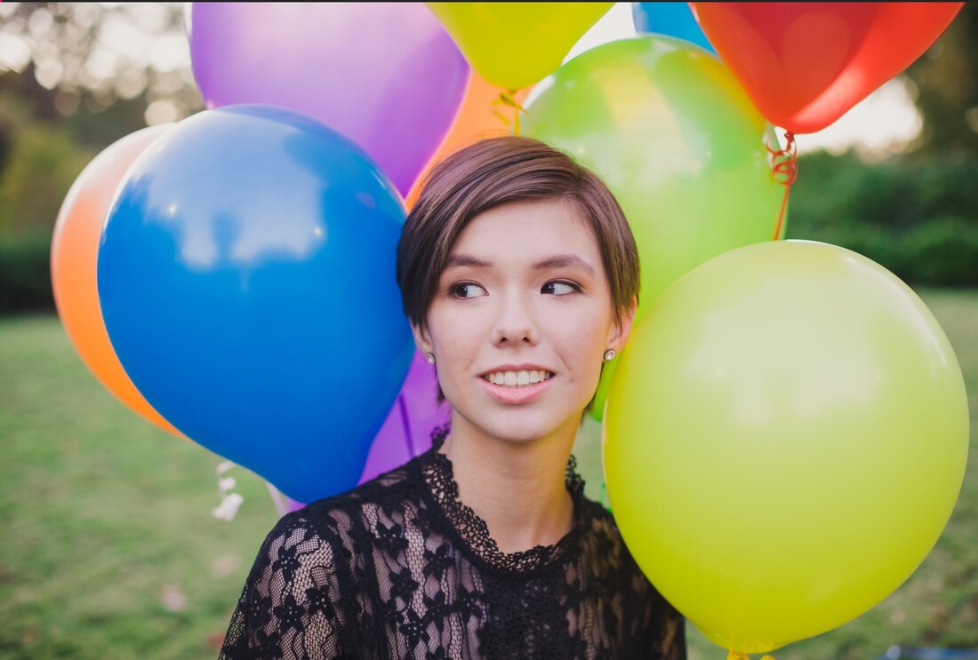
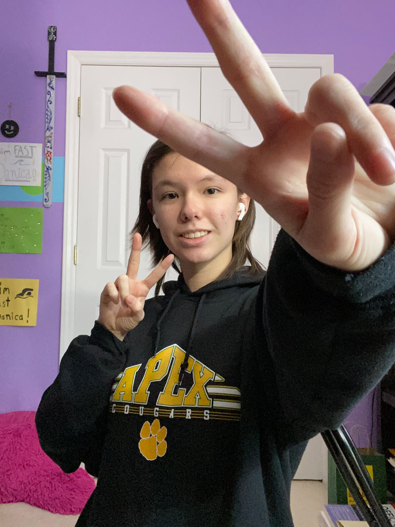
Description: The image I drew is a photograph of me. In the drawing my face is centered and I am smiling while my eyes are looking to the left. I have shorter hair in this picture (a pixie cut), and you can only see from my collarbone up. My body is facing slightly to the right. I am surrounded by balloons to the side, above, and behind me. The balloons are all very colorful, there are some green ones, some red ones, some purple ones etc. These balloons take up most of the rest of the frame and all the balloons are extending out of the frame. The background is made up of blurred, natural colors like green and brown. I am wearing a lace dress with flowers on it and a lace collar. I also have pink earrings on.
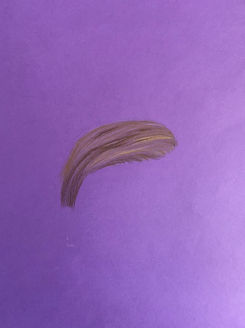
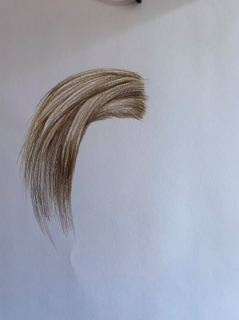
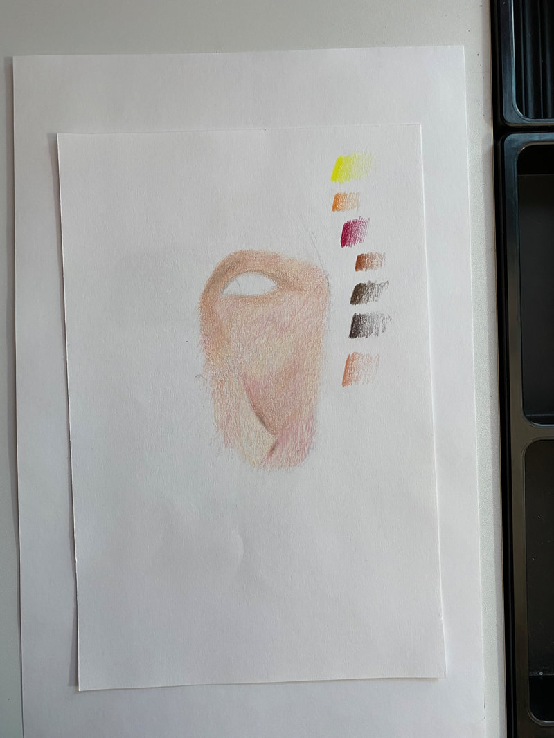
Analysis: In this piece the elements of color, space, and texture are used. There are lots of values in this piece because of all the balloons. However, the dress I am wearing is black, and adds contrast to all the brightly colored balloons, making the colors seem to pop more and drawing attention to my face, which is surrounded by balloons. Space is used in this piece as well. The balloons take up most of the frame, and since the picture was taken close up, almost the entire paper is filled, very little of the background can be seen. This makes the space feel more intimate when viewing my piece. The balloons surround and frame my face creating a small space that emphasizes my face, which is the thing the view will be most drawn to. Finally my piece uses texture. The balloons make up a large portion of the piece, and are all smooth with little texture. To balance this the collar of my dress is made of lace, which adds detail and texture to the piece, especially since my face is mostly smooth with only a few creases. In my piece the principles of proportion, balance, and depth are used. In my piece the features of my face, my body, and the balloons are all in proportion. I spent a lot of time gridding my work while referencing the original photo to ensure that all the features would be as proportional as possible to each other. Balance is used in my piece through the color and texture in the piece. The smooth, colorful balloons are balanced out by the black, detailed lace of my dress. Additionally in my face the paler, highlighted regions are balanced out by the shadows and reflected light on my neck. My piece uses depth through the foreground and background. My body and the balloons are in focus, but the background is blurred giving the sense the balloons and I are closer to the camera, and that the nature in the back is further away, creating depth. Additionally my left shoulder is farther back and is blurred compared to my right shoulder. Interpretation: In this piece I tried to go for a realistic style, but ended up simplifying parts of the reference photo to make sure the focus of my piece was on my face. I made my face, hair and neck very detailed, I really focused on the shading, colors, and proportions. However, for the background, balloons, and dress, I simplified these things so that they didn’t take away from my face. With the balloons I tried to get the colors and shading right but left some of the balloons clearly looking like they were drawn with colored pencil. I simplified the detailed design of my lace dress and tried to draw the dress material in one shade to imply a see through, netted material rather than draw each individual piece of lace. I kept the background as a bunch of blurred colors that kind of implied some nature behind me, because I didn’t want any detailed pieces of nature to detract from my face since the background could only really be seen on the surrounding balloons or right next to my face. I showed meaning through this piece through my facial expression and colors. I chose my reference photo because of all the vibrant colors, and because of my facial expression: I am smiling while looking off into the distance. I wanted to convey the happiness I felt when the photo was taken, and how promising and exciting life felt through my expression and all the colors. I tried really hard to emphasize the colors of the balloons and get my smile and eyes right in the piece. I wanted my piece to remind people that even though life is different now during the pandemic that life can still be beautiful and filled with happiness. We just have to keep looking forward to the future. Judgement: In this piece I found the face, hair, and neck the most successful pieces. These were the spots I focused on details with the most. I think my shading and colors were successful with these parts, and with the hair I think I did a good job of defining different sections without really outlining anything. If I were to do this again, I think I would try a different approach for the dress. The dress I had on in the reference photo was made of detailed lace, and I was afraid that having too much detail in the dress would take attention away from my face, so I simplified the dress. I tried to create a lace look by making the dress one color that looked like a see through gray material was resting on top of my skin tone. However, I think this approach could have been executed better since in my opinion I think my dress ended up looking like a dirty gray instead of a see-through material. If I were to do this again I would try and draw in some small patches of lace overtop my skin tone and see if those detract too much from the face.
0 Comments
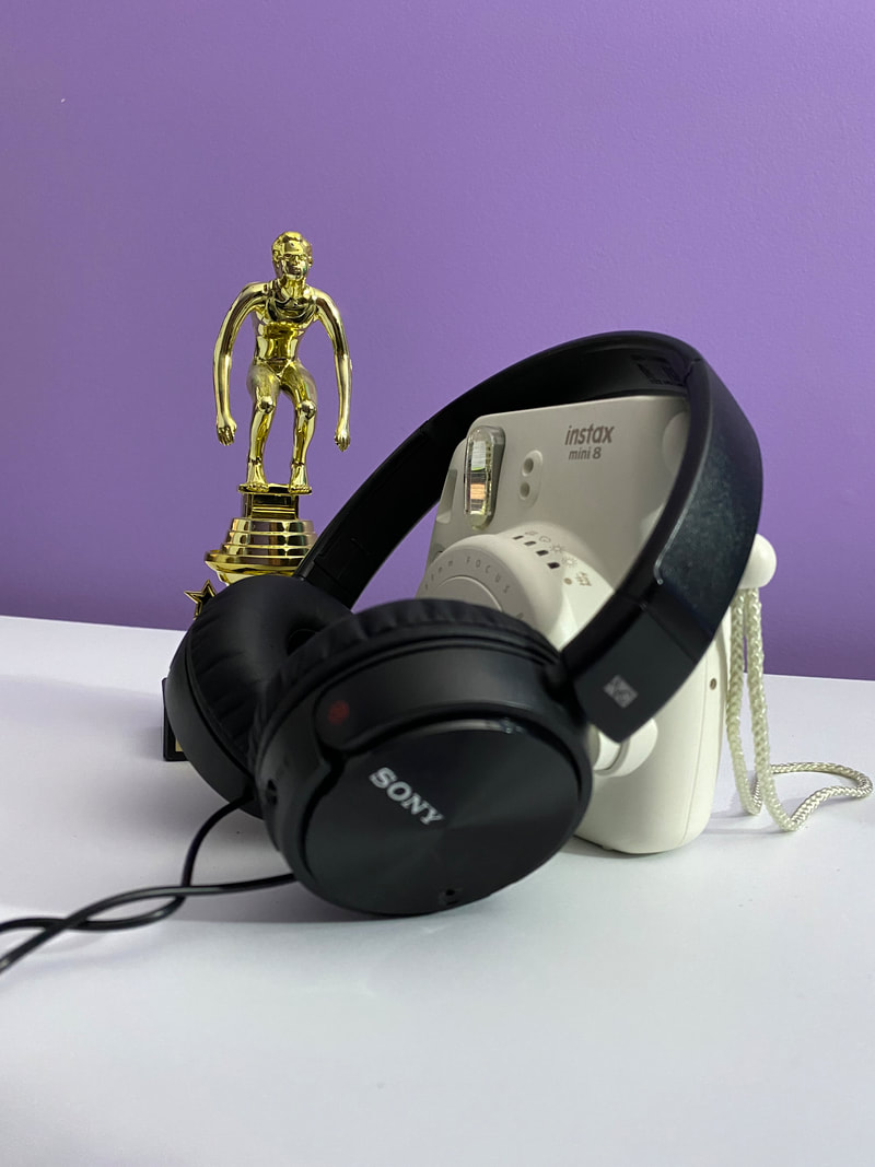
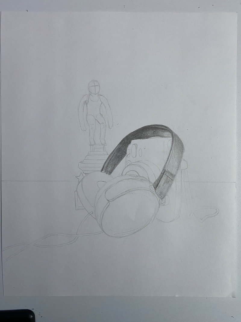
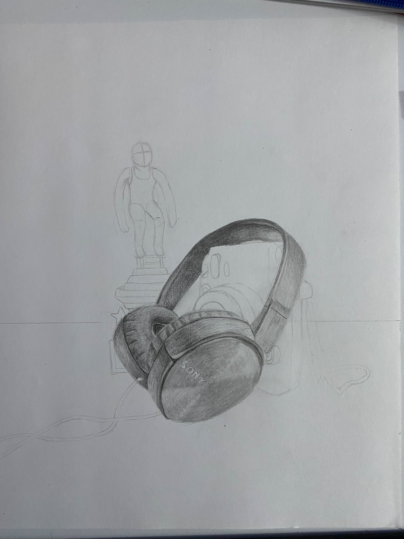
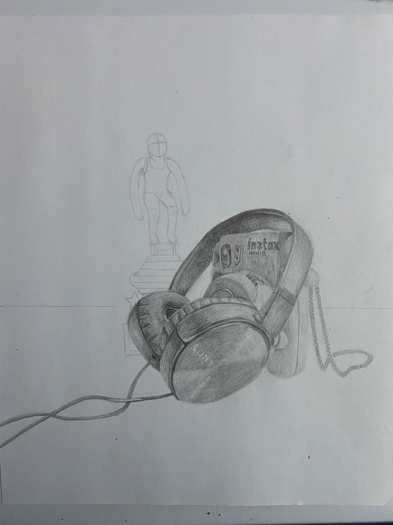
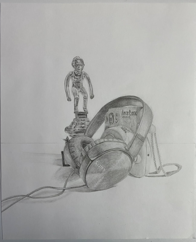
Description: In my still life I included three objects. The first object is an instax mini 8 polaroid camera. The camera is positioned on the right and is slightly angled towards the center of the picture. The second object is a set of Sony headphones. The headphones have been laid on top of the camera with the cord trailing off to the left. The third object is a swimming trophy. There is a swimmer standing on a diving block in a crouched position as if he is about to dive off. The trophy is positioned on the left and is behind both the headphones and camera so it is partially covered.
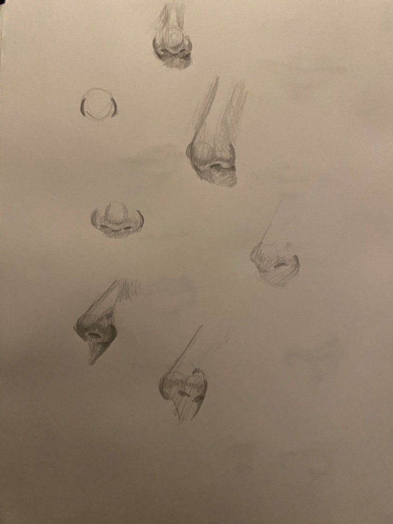
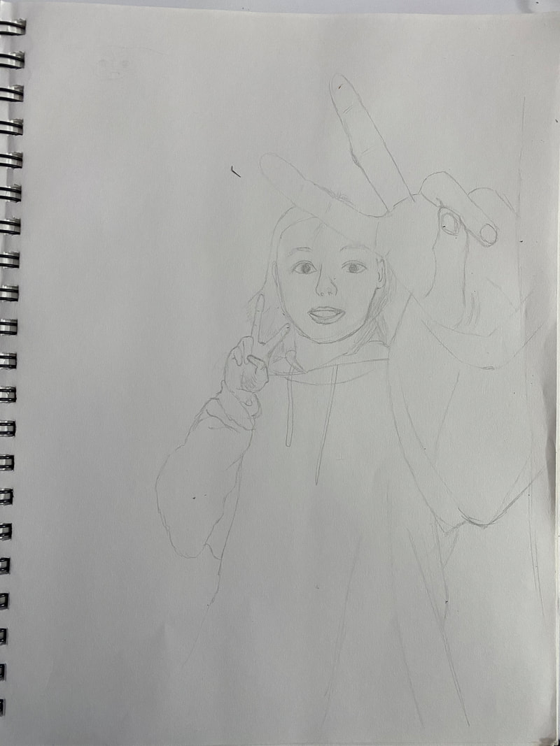
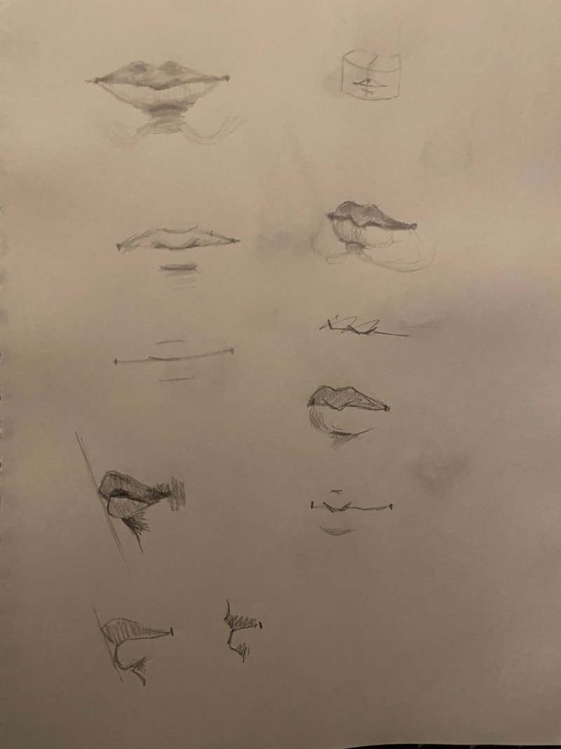
Analysis: The viewer's eye will most likely be drawn to the earpiece of the headphones since this is a large part of the drawing and is closest to the viewer’s eye. It is also very close to the center of the drawing. Next the viewer’s eye will follow the curve of the headpiece of the headphones over the polaroid camera. The wire from the headphones helps guide the viewer by emphasizing the curve of the headphones that the viewer’s eye follows. There is a lot of detail at the top of the camera that will catch the viewer’s eye and help guide the viewer. Finally as the viewer continues to follow the headpiece they will reach the base of the trophy. The base of the trophy gets narrower as it goes up which finally helps guide the viewer’s eye up the trophy to the figure on top. Interpretation: The headphones in my piece represent my love for music. I listen to music every single day when I’m working, eating a snack, or when I have free time between classes. With online school and coronavirus keeping me at home more than usual, I use music as a way to relax. The polaroid in the piece represents my love for photography. I like taking pictures because I like setting the subjects up and trying to capture my feelings through the photo. I like physical pictures better than digital ones because I like hanging them up, I have a whole wall of photos in my room. However, the polaroid also symbolizes my love for my friends, and how I love making memories with them. I bring my polaroid camera to most of my meetups with my friends because I love capturing all the memories. My friends are a huge part of my life and they mean the world to me. The polaroid gives me a way to make physical totems of all my memories with them. Finally the trophy represents my love for swimming. I’ve been swimming since I was seven years old. I love the water, whether I’m at the pool, beach, or scuba diving. Some of my best memories and friends were made through the swim team. I really enjoy and value swimming, which is why I chose to include a trophy from one of my past seasons. I used graphite pencils to make this piece. I wanted to use a pencil because I like the detail and precision I am able to get with a pencil since I typically have better control when using a pencil compared to another medium like chalk. I chose to use graphite pencil because I have a wider range of graphite pencils than charcoal, and wanted to include more values. Having more pencils would also help me layer and build up my drawing. Judgement: I do feel that my drawing is a good representation of who I am because the objects I picked all represent major parts of my life that have shaped me into who I am today. This piece visually represents my major hobbies. The viewer can also tell that I put a lot of effort into this piece, and focused a lot on the details and precision of my work. This also represents me because I tend to put a lot of effort into my life, and I like things to be detailed and neat, similar to this piece. Sketches:
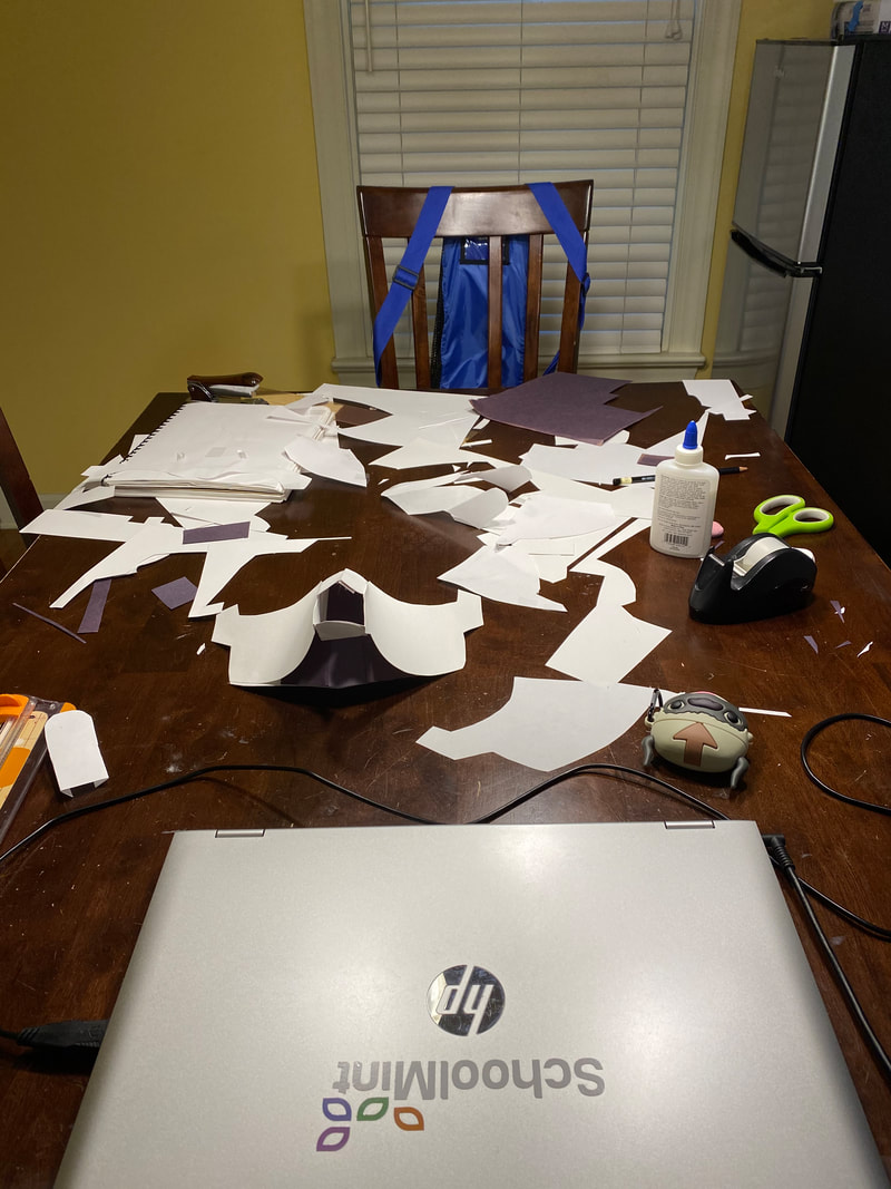
Experiments:
In Progress:
Finished: 
Description:
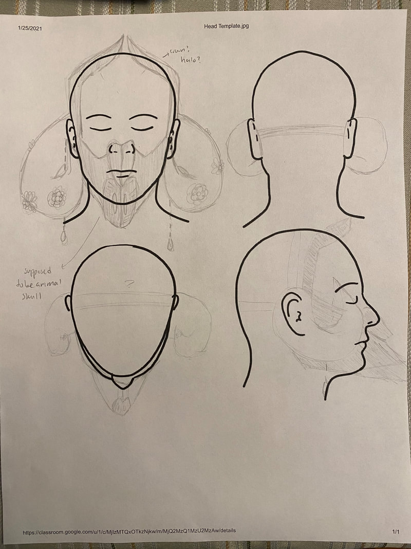
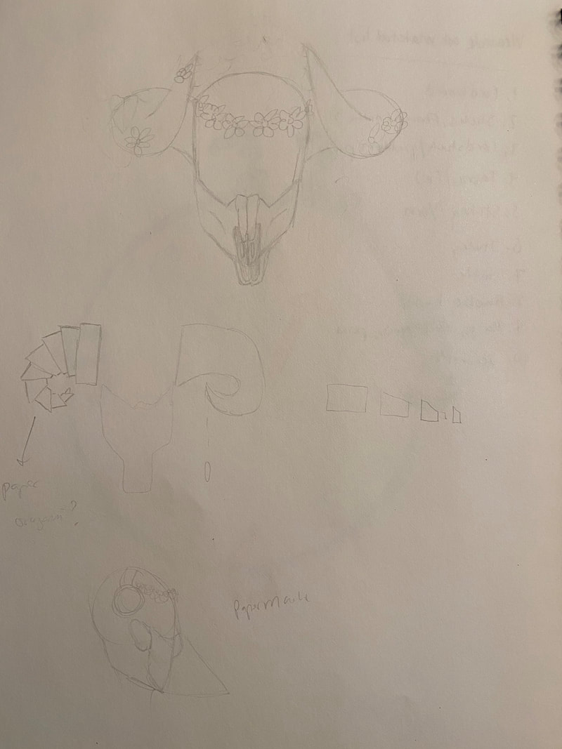
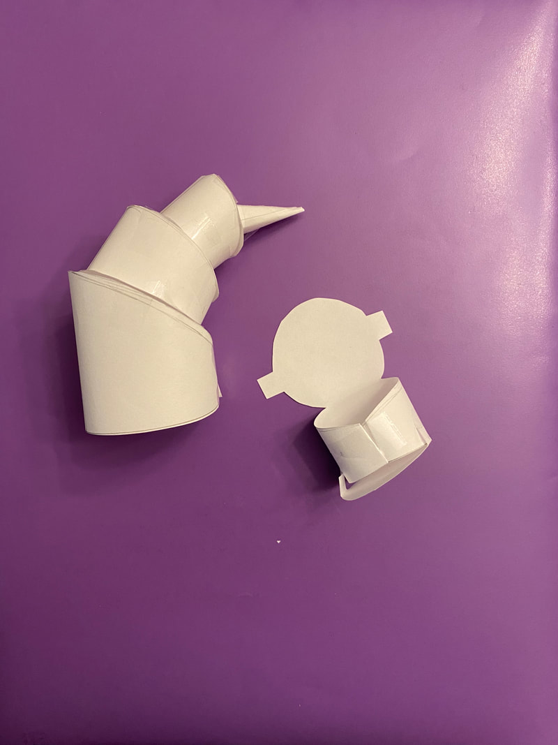
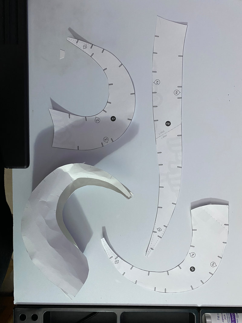
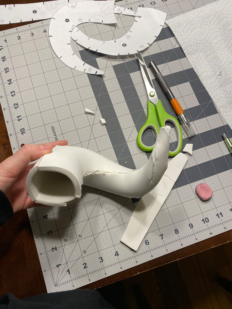
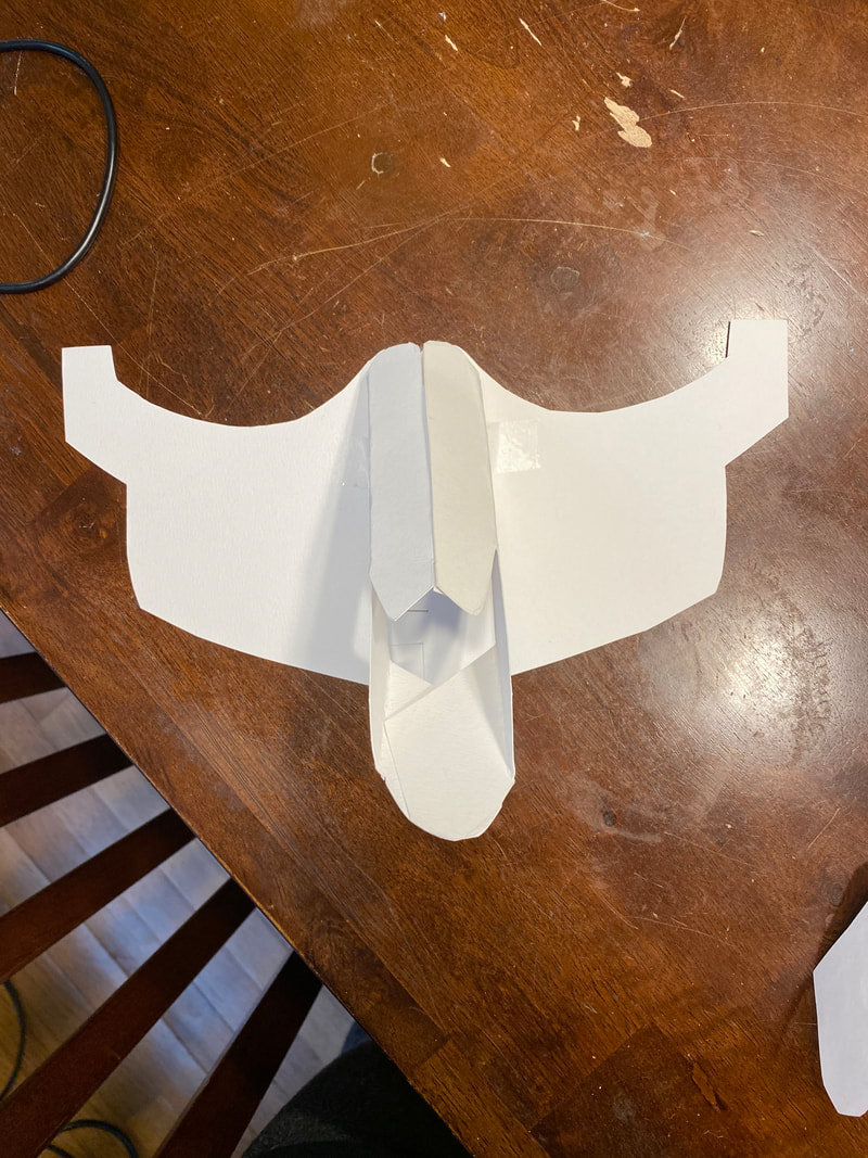
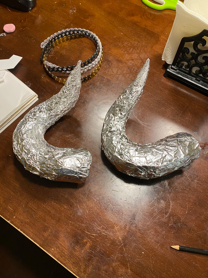
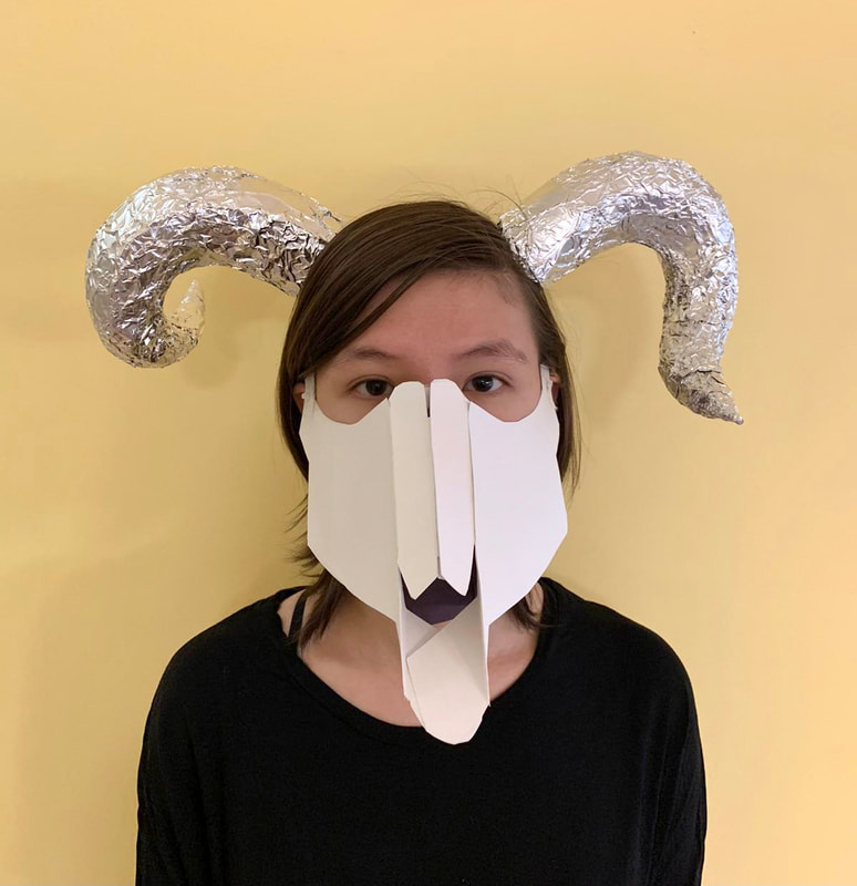
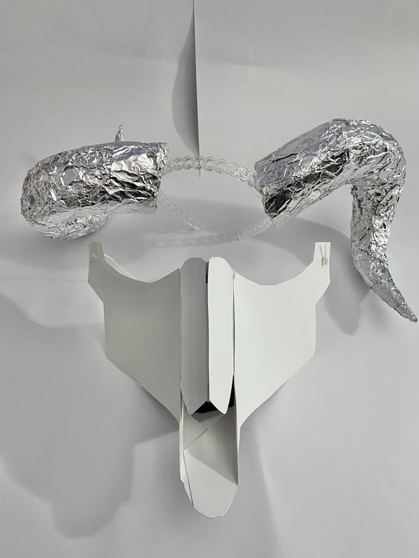
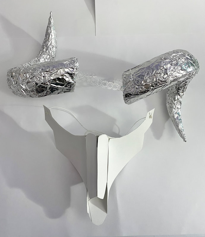
My piece is based off of a ram skull. It is made of two pieces, a mask, and a set of horns. The mask is made of white watercolor paper. There is a hollow, rectangular tube of paper attached to the mask so that it is pointing down about 45 degrees. The tube has been cut so that the top side is bent down the middle, and the two halves point downward similar to a bridge of a nose. The two sides have been cut at an angle so that the button side sticks out further than the top. This tube looks like the nasal region of a ram skull. There are two pieces of paper that are attached to the sides of the tube and the end of the mask-shaped paper that everything rests on. These are smooth pieces of paper that make the mask look like a 3D skull with cheek bones. The mask shaped paper that everything is attached to is black so that when the mask is looked at through the nasal cavity, it looks like an actual hole, with empty space inside. The entire mask rests on the bridge of the nose, and curves under the eye to the ears. The other piece of my art is a set of horns. The horns curve away from the head. Then one horn curves towards the direction the person is facing, and the other curves away. This is because I accidentally made two of the same horn and couldn’t achieve a mirror image. The horns are covered in reflective aluminum foil to add texture and are attached to a plastic headband that rests on the head. Analysis: My piece is cohesive. In terms of color, I decided my piece would stick with "neutral colors." Because my piece is modeled after a skull, white was the main color I used. I used black paper in my mask to create the illusion of empty space in the skull while also sticking to the color scheme. My horns are a silver color which complements the white color and adds to the piece through the reflective nature of the aluminum foil, without outshining the mask. My piece is also cohesive because the two parts work together to create one skull. I think my piece is visually balanced. With the mask, there is a lot of attention drawn to the lower half of the face. I balanced this by positioning the horns to bring attention to the sides of the face, and I also used reflective material so that the horns wouldn’t get lost in the piece, and would be defined pieces. If I had curved the horns upward, I feel like there would be too much empty space between the horns and the mask. Interpret: The overall mood from this piece is reflective. My piece invokes raw and unfiltered emotions. For starters my piece is a skull, and is related to the topic of death. A skull is underneath all the other parts of the body. My piece is just a skull, with nothing on top to hide it, it’s the deepest part of people that has been exposed to the world. Additionally, many people are scared of death. It is depicted as a gross, cruel, and terrifying thing that steals us from our world. However, in my piece, death isn’t represented like this. The skull isn’t broken and mangled, it’s intact, and made of smooth pieces of paper. The horns are not perfectly smooth, but they are reflective, they’ve been altered to be more appealing and beautiful. My piece depicts death as something other than scary. It may not be comforting or perfect, but it isn’t scary, it simply exists. My piece shows and symbolizes a lot of raw emotions and topics, but does so in a way that will make the viewer think about our interpretations of these topics and emotions. Judge: I feel like my piece was mostly successful. I was extremely happy with the skull mask. I did not use a template to make the mask, I made the design myself with paper by slowly trimming multiple pieces down until I was satisfied with it, and then making it again with watercolor papers. I was also happy with the shape of the horns, they curve really nicely and I was happy with how they turned out since it was my first time using that specific template and material. However, when I made the horns, I accidentally made two of the same horn, so I was unable to achieve the perfect mirror image I had planned on. I had also planned on adding flowers to my piece. However, I ended up making aluminum foil tips for the horns (because the foam tips weren't pointy enough) and then to make the entire horn feel cohesive, wrapped the whole horn in foil. I felt that the shiny, metallic look of the horns no longer fit with flowers, so I left those out. Although the piece looks good, I feel like it is much simpler than I originally wanted.
|
AuthorWrite something about yourself. No need to be fancy, just an overview. Archives
June 2021
Categories |


 RSS Feed
